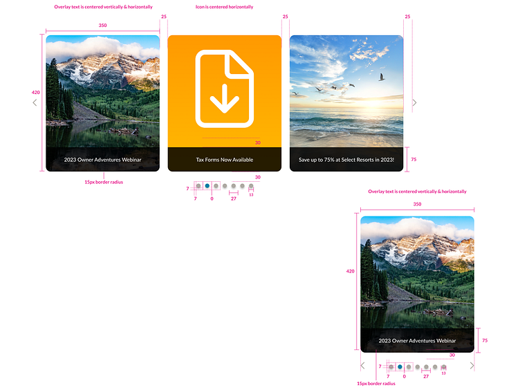
Carousels
This is part of a design system I'm working on. See the reference site.
——————————
Some guidelines:
Clear and Concise Navigation: Provide clear navigation controls for users to navigate through the carousel easily. Common controls include arrows, pagination dots, or swipe gestures for touch-enabled devices. Make sure these controls are easily visible and intuitive to use.
Limit the Number of Slides: Avoid overcrowding the carousel with too many slides. Having too many slides can overwhelm users and diminish the overall experience. Keep the number of slides to a minimum, focusing on important content or key messages.
Display Relevant and Engaging Content: Each slide in the carousel should contain relevant and engaging content. Avoid repetitive or redundant information. Make sure the content within the carousel aligns with the user's goals and expectations.
Consider Autoplay Carefully: Autoplay can be useful for attracting attention and showcasing important content, but it should be used with caution. If autoplay is implemented, ensure that it doesn't disrupt the user's experience or interfere with their ability to interact with the carousel.
Provide Ample Time for Reading: If the carousel contains text or requires users to read information, provide enough time for users to consume the content comfortably. Avoid rapid transitions between slides, as it can make it difficult for users to read or comprehend the information.
Use High-Quality Visuals: Visuals play a crucial role in carousel design. Ensure that the images or media used within the carousel are high-quality and visually appealing. Optimized file sizes are important to maintain performance and loading times.
Responsive Design: Carousels should be designed to be responsive, adapting to different screen sizes and orientations. Consider how the carousel will appear on mobile devices and ensure that it remains usable and visually appealing across various platforms.
Accessibility Considerations: Pay attention to accessibility guidelines and ensure that carousels are accessible to users with disabilities. Provide alternative text for images, ensure proper keyboard navigation, and consider the needs of users who may have visual impairments or cognitive disabilities.
A/B Testing and Analytics: Conduct A/B testing to evaluate the effectiveness of the carousel design and gather insights into user behavior. Use analytics to track user interactions, such as clicks and engagement rates, to make data-driven decisions for optimizing the carousel.
Performance Optimization: Optimize the carousel's performance to ensure smooth transitions and fast loading times. Compress and optimize images, minimize the use of animations or effects that may impact performance, and consider lazy loading techniques to load content as needed.
