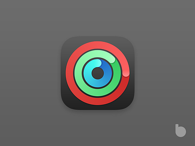
Activity App Icon Redesign
Since the introduction of the Apple Watch app and its little hidden companion, Activity, I've felt something was wrong with them.
The original Activity app plays with these little circles to represent the app itself, and that's a good point, but I feel these circles are too static.
A bit of dynamism is always good.
I've also changed the colors to make them look more vibrant.
What do you think?
More by Giulio Smedile View profile
Like
