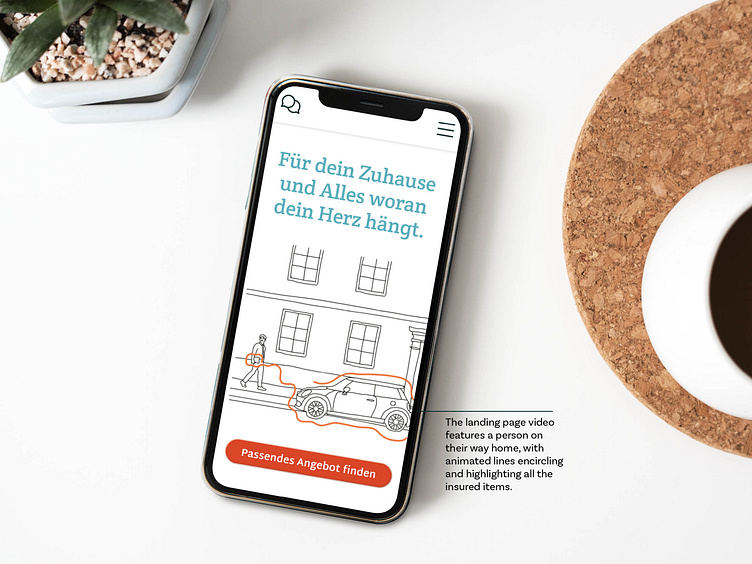
Insurance Mobile Landing Page
The first design draft of the page. On the landing page, images were placed in accordance with the style determined in the mood board. A line was added to bring movement and enclose the 3 categories. The service functions were still represented with a nice illustration. Customer reviews were already presented in their final format.
Another Iteration of the design file.
The images were given their curved frames. Sections were divided with wavy lines to introduce a bit more three-dimensionality. Customer reviews were placed without images, and the sustainability information was implemented using an overlay function. The headlines also have a subtle appearance.
Insurance Website – Pattern Library
Thanks for reading!
Do you want to see the final results? Here is a link to the final prototype of the design file. Figma Prototype Link


