EGEO
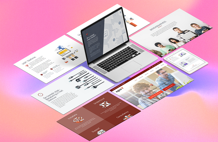
Egeo, an IT consulting firm based in Belgium, sought to update their website and inject new life into its outdated and rigid design by incorporating modern design elements and visuals.
This task is often a significant challenge for organizations, especially when introducing new concepts to existing markets. Visitors to the website are typically curious about the product, its functionality, and why they should care. The updated website effectively addresses these questions, showcasing the product while compelling users to take action through compelling call-to-actions and contact forms. Notably, the website implements "scroll hijacking" appropriately.
The website stands out with meticulous attention to detail, featuring a long-scrolling, content-focused design with over 20 slideshows. It is structured in a way that progressively and visually communicates the product's features and services in a simple and easily understandable manner. The brand symbol is consistently used throughout the site, including as the favicon, preloader, section backgrounds, sliders, and titles. Strong graphics, captivating images, subtle animations, and responsive layouts are also notable elements, enhancing the overall user experience. Additionally, the interactive and user-friendly contact form design contributes to the website's highlights. Each page concludes with a call-to-action button at the bottom, encouraging further engagement.
Like it? 💗 it.
We greatly appreciate your support and would love to hear your thoughts on this project.
Interested in partnering with us on your next project?
Send us a message, and let’s discuss how we can assist you. Drop us an email at projects@xclamatory.com if you would like to talk about creating a brand or a digital product.
More about us on xclamatory.com


