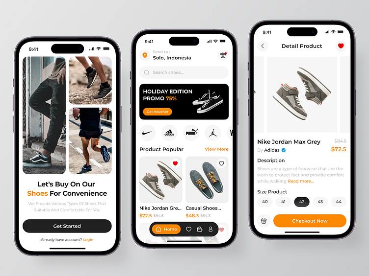
OnStep - Shoes Store
Hi Everyone! 👋🏻
I'd like to drop my case study for shoes store app of my exploration. Let’s dive deep into it for the better explanation!
The Challenges
Shoe store applications often have deficiencies in providing detailed informations that are incomplete, grouping categories that were unclear so that users have difficulty finding the shoes they want and the difficulty in checking out or buying the items that they want easily so that it has an impact on user productivity.
The Solutions
We will provide users with clearer information on product detail pages that can be easily understood so users can receive actual information, provide shoe categories on the home page directly by displaying their products so users can find the product they want quickly & easily. We provide the action of entering the cart on the home page and product details together with the checkout action, so that users can more easily enter the product or reviewing the product in the cart or buy the product directly.
_______________
Interest to partnering with us? Say hello at hellodama@odama.io or visit our website odama.io
Check us more at:
📷 Instagram | 🛒 Gumroad | 🎉 Figma Community | 🛍 Creative Market
