Mobile game leaderboard - UI exploration
Bonjour ! 🥐
This is part of the Shift Nudge course learning interface design.
The goal
Content hierarchy.
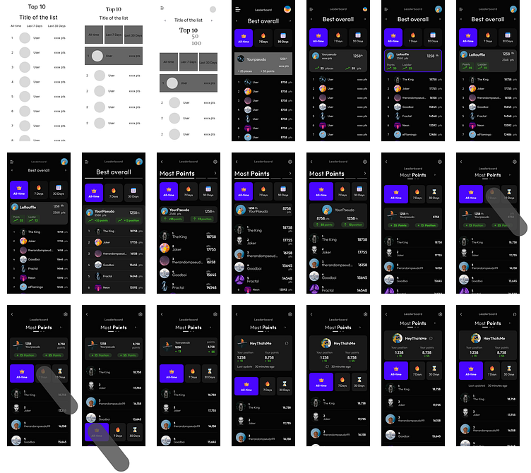
While I was designing, a thought sparked and led me to reflect
on the hierarchy, resulting in improvements for the end user.
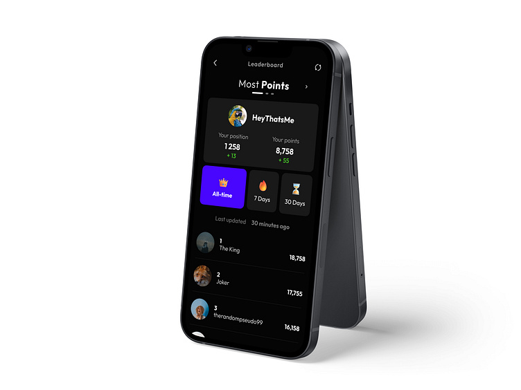
1 - Category
2 - User stats
3 - Filters
4 - Scores
The filters were placed above the global ranking system,
even tho it made sense for them to be positioned at the bottom.
By aligning the filters with the user's stats, we established a stronger connection and made it easier for users to focus on what they really wanted to achieve—monitoring their progress and current status.
