Presentation Slides: Outline Style Notes
Q: What do you do when the aspect ratio of your screen is 22:9? (yes, a normal "widescreen" is 16:9.... so she wide!)
A: uh, you have to get creative 😅
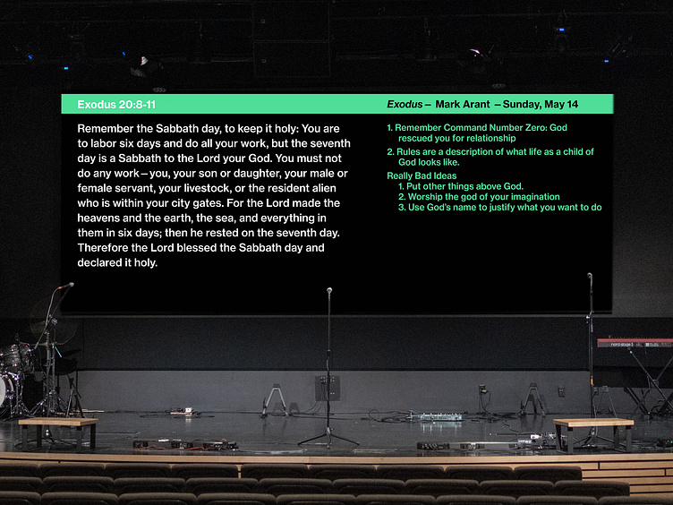
Seriously though, once I embraced the wide dimensions of our screen, a whole world of typographic opportunities opened up! For the past two years of sermon series, I've been designing some variation of "outline style" notes, in which the main points build on the right side of the screen - the current point is highlighted in white, and the previous points are dimmed out. The scripture shows up on the left-hand side, only when it is being read - and then disappears when the focus turns back to a main point. The goal is to support the speaker visually, without being distracting - and I think it's working really well. It's actually a super fun and engaging way to communicate ideas!
If you're curious how this works in real-time, check out a live sermon at Veritas Church of Iowa City's YouTube channel!
And of course it's more than just screen notes, it's a whole visual identity: so a matching title slide and YouTube Thumbnail for the Live Stream is a must. 💁🏼♀️


