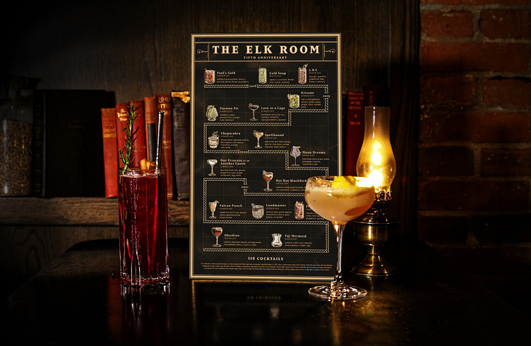
5th Anniversary Menu
During the Ideation phase, the design team and I considered, how to communicate the idea progression of time while still highlighting the individual cocktails. With these ideas in mind, we decided to use a timeline to show the passage of time. Using a timeline for layout would contribute to achieving our overall goals; highlighting the anniversary of the restaurant, and showing the uniqueness of the cocktails over the years.
For this project, the client wanted to go with a “tiki-style design” that involves every cocktail on the menu each having its own graphic. When working on these illustrations, I knew I needed to highlight the glassware, garnishes, and type of ice for each drink. These attributes are crucial to the design, as they are all critical to the guest’s enjoyment and overall experience of the beverage. To better highlight these unique attributes, I decided to go with a figure-ground illustration approach. This provides a way to display what makes each cocktail special, while still reliably conveying the color of each beverage.


