Lisner - creative landing page
Challenge:
This is not the first project we have implemented with the Lisner brand. This time, a client asked us for support in preparing a creative concept and designing a website dedicated to the new campaign “Herring has many faces”.
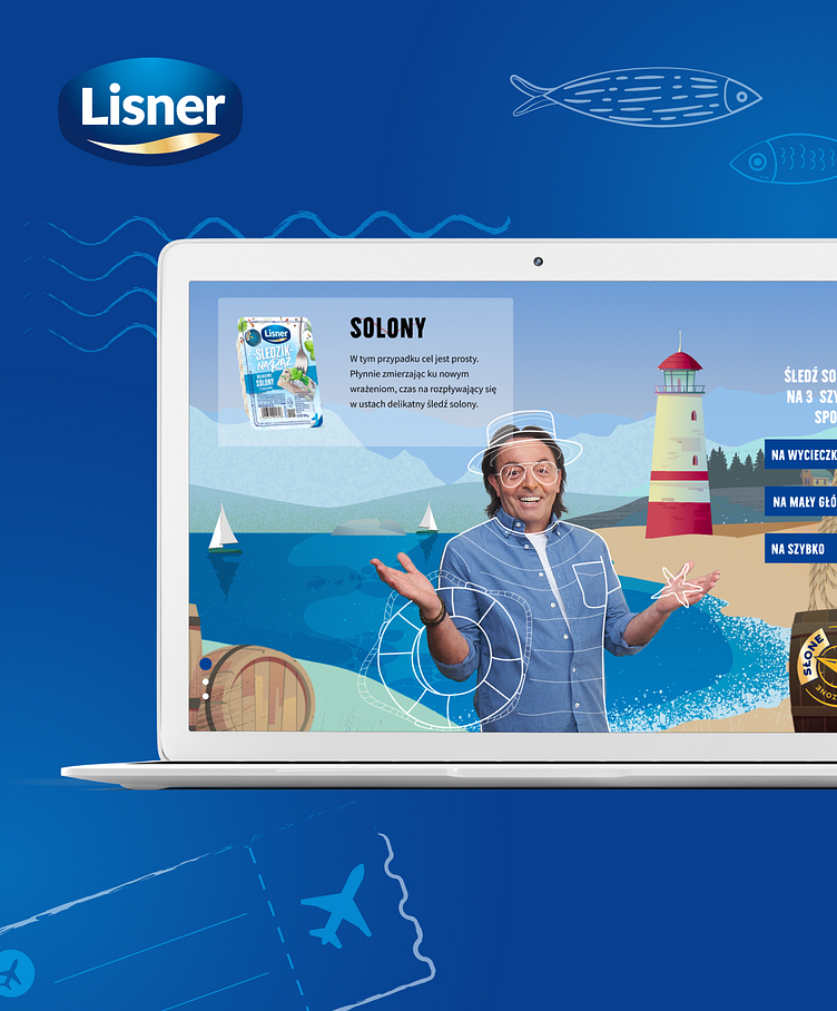
The main task of the website was to present Lisner’s new offer in an unconventional way. New flavors of herring were promoted – salted, smoked, and sweet and sour. In reference to the image spot broadcast both digital and TV, we have created a content-consistent concept of a landing page that engages the user.
THE FINAL RESULT THE FINAL RESULT THE FINAL RESULT
We started our work with a workshop session with the client, during which we refined the concept proposed as part of the offer. The idea was based on using the image of Michel Moran (brand ambassador) and showing him in three completely different landscapes thematically referring to the new flavors of herring. The element engaging the user was based on matching the horizontal scroll with the changing landscapes in the background in accordance with the compass of flavors placed on the website.
After the workshop, we prepared UX mock-ups and a list of ideas for placing information about the landing page on Lisner’s homepage. The next step was to create a graphic design. Illustrations were created for each scenery – sea, forest and party. A photo of Michel was placed in the center, and outlines of attributes related to a given taste and landscape were created around his figure.
The website also has a section with recipes containing new Lisner products and a place where the user can watch the image spot of the campaign. We designed a sliding panel on which we placed the product with a description and buttons with three recipes for every occasion.


