Broworks - Brand Refresh

Yellow background with geometric shapes and 8 letters

A lot of work, brainstorming, and analysis led us to the new, fresh look of Broworks. Check it out!We have always been very proud of our brand mascot Hiro, as he was a part of our old logo. However, as we grow as a company, a more serious approach is due.When creating the new logo, we opted for a more straightforward and modern look. So, we removed Hiro from the logo but kept him as a mascot and part of our culture.

grey and dark green background with abstract shapes and dashed lines

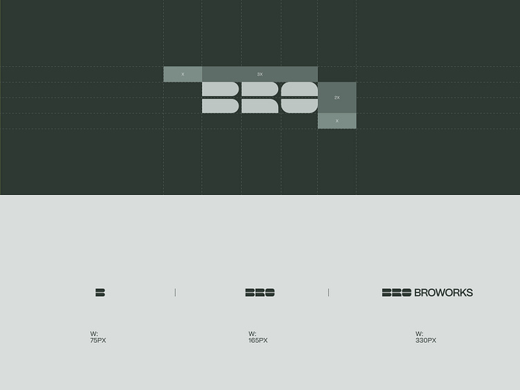
The new Broworks logo is built from elements that have different rounded corners. These shapes proved to be perfect building blocks, forming the word BRO. As we delved deeper into the design, we saw that they could be used in various solutions - in branding and our new website design. Thus, these logo shapes became the basic building blocks of the new brand.

Yellow and dark green color shades

Apart from the logo, we also redesigned our website. Our team has grown and we have fresh ideas every day.

Expect to see new web design shots soon.

Stay tuned to see the full rebranding of Broworks!

Check out the full presentation on Behance

Our live website is here

Follow us for more:

INSTAGRAM | BEHANCE | TWITTER | LINKEDIN

Light yellow background with a lot of text from tiny to huge size

Apart from the logo, we also redesigned our website. Our team has grown and we have fresh ideas every day. Expect to see new web design shots soon.

Stay tuned to see the full rebranding of Broworks!

Check out the full presentation on Behance

Our live website is here

Follow us for more:

INSTAGRAM | BEHANCE | TWITTER | LINKEDIN

More by Broworks

View profile