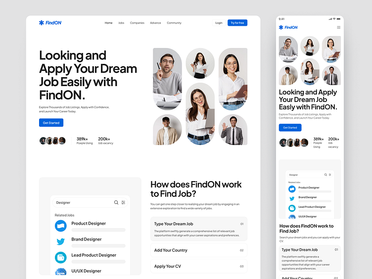
FindON - Job Finder Responsive Website
Hi World 🙌✨
Today I want to share with you the concept of a FindON - Job Finder Responsive Website Design.
Overview
The goal is to design a responsive website called FindON that provides users with a clean and user-friendly experience. FindON aims to help users locate various services, businesses, or places of interest in their vicinity quickly and efficiently. The website will adapt seamlessly to different devices and screen sizes, ensuring accessibility for all users.
Challange
The primary challenge in designing FindON lies in creating a responsive website that looks visually appealing and user-friendly across a wide range of devices, including desktops, tablets, and smartphones. It is crucial to strike a balance between aesthetics and functionality while maintaining consistency in design elements. Additionally, incorporating features that enhance the user experience and facilitate easy navigation poses a significant challenge.
Solution
To overcome the challenge, the following solutions can be implemented:
Responsive Design: Utilize a responsive design framework to ensure the website's adaptability to various devices. This approach will enable the content and layout to automatically adjust according to the screen size, providing a consistent user experience.
Minimalistic and Intuitive Interface: Adopt a clean and uncluttered design, employing a minimalist approach with ample white space. Use a clear and legible typography that enhances readability. Intuitive navigation menus and prominent search functionality will allow users to quickly find the information they need.
Mobile-First Approach: Prioritize the mobile version of the website during the design process. Optimize the user experience for smaller screens by focusing on essential features and content. This approach will ensure a smooth transition to larger screens while maintaining usability.
Consistent Branding: Establish a consistent visual identity throughout the website, using a cohesive color palette, typography, and graphics. Consistent branding creates a sense of trust and familiarity, enhancing the overall user experience.
User-Centric Features: Incorporate user-centric features such as filters, sorting options, and personalized recommendations to improve the search and browsing experience. Implement location-based services to provide tailored results based on the user's geographical location.
Performance Optimization: Optimize the website's performance by minimizing load times and optimizing images and other media assets. A fast and responsive website enhances user satisfaction and encourages longer engagement.
User Testing and Feedback: Conduct usability tests and gather feedback from target users to identify potential pain points and areas for improvement. Iteratively refine the design based on user insights to enhance the overall user experience.
Full Preview 🙌
Thanks For Scrolling! ✨
I hope you guys enjoy it. Press "L" if you like it.
Let's talk: shafiradivaaulia@gmail.com | Instagram @designbydipaul
📧 Have a project idea? We are available for new projects


