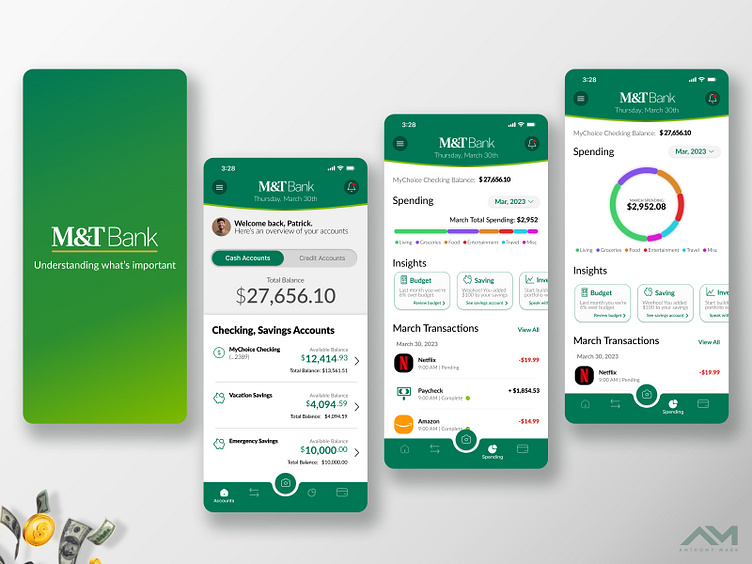
M&T Bank - App Refresh Concept
This is an app refresh concept I did for M&T Bank. The goal here was to make it more user friendly, visually intuitive / appealing and adding in some additional in app features.
Additional in app features include:
Adjustable budget goals with interactive tracking
Key insight suggestions for user's to review
Popular transaction icons
More negative white space to make obtaining information on page easier and more enjoyable.
Added benefits to M&T Bank and it's users include:
User's spending more time in app managing and tracking their budget.
User's being more mindful of their spending habits
With additional time spent in app and better tracking of customer spending, more opportunities exist to qualify AND quickly have customers apply for credit cards, home mortgage and other lines of credit.


