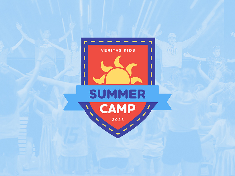
visual identity + merch: summer camp
The theme of this year's Veritas Kids Summer Camp? The Armor of God + Medieval Adventures!
Every year the visual identity contains some sort of sun imagery, so I wanted to keep with that tradition while still leaning into this year's theme. ☀️⚔ "Armor of God" can be tricky - don't want to be overly literal or cheesy - so I went with a subtle shield shape [that also resembles an Ancient Family Crest]. Together they're a perfect combo of medieval battle imagery while still being fun and age-appropriate!
Honestly, I'm so proud of how I customized this design for printing on tees - I think sticking with one color of ink and using negative space to imply shading was the way to go! I think we nailed the "medieval but kid-friendly" brief, don't you? 🏰 🎈


