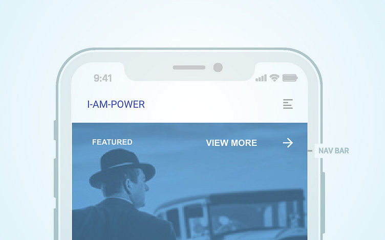
I-AM-POWER • Mobile • v1
The mobile version of I-AM-POWER is designed with ergonomics in-mind. As the size of smartphones increases, their one-hand usability decreases: it is simply too much space for one thumb to cover. We considered this as we placed important elements near the bottom of the screen. The smartphone template we used for designing these wireframes shows where important system UI elements will appear, giving us a better idea of sizing and spacing. We used oversized icons and large cards to make things easier to tap.
More by Jani Momolu Anderson View profile
Like


