Stepwest - Logotype and Brand Identity
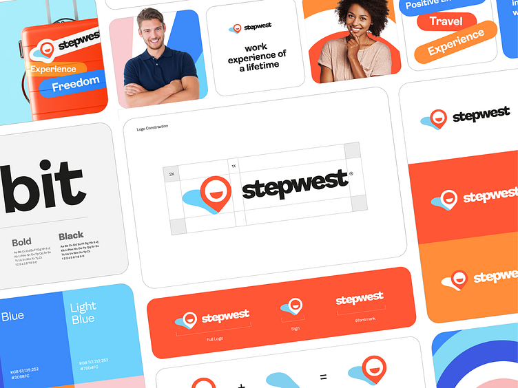
About The Project
Stepwest is one of Canada's fastest-growing work and travel providers and a Recognized Organization (RO) by the Government of Canada.
Stepwest about himself:
We want to be able to provide both Canadian and foreign youth with the same amount of opportunities to travel to a new country and to gain work experience. Through these experiences, we aim to see youth immerse themselves in a new culture and eventually grow into mature and well-developed citizens who will be active and engaged members of their respective communities.
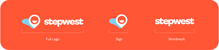
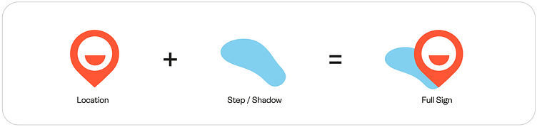
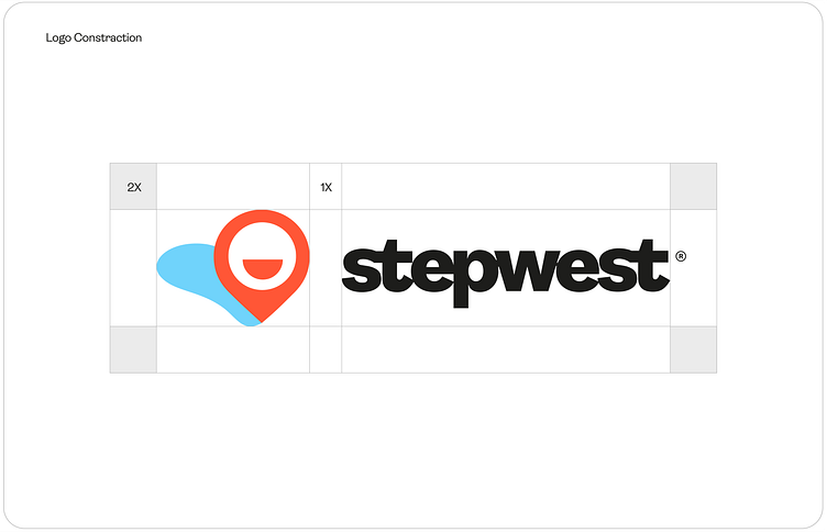
Logo Design
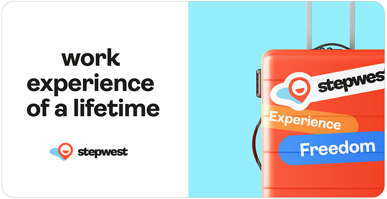
The footprint under the geolocation sign symbolizes the ease with which anyone can become a part of the stepwest program and leave their mark in the place they have always dreamed of going to.
The text part of the logo uses letter fusion, which makes the logo compact without compromising readability.

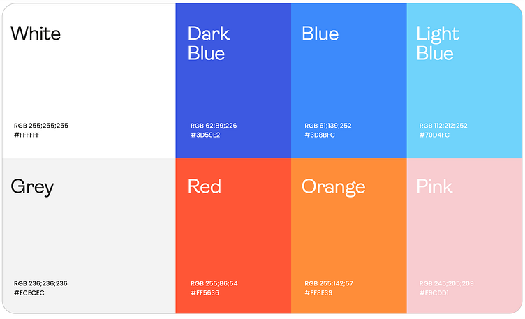
Colors
Colors are the calling card of the brand. They should represent lightness, relaxation and travel, so the emphasis was placed on a palette of colors that are associated with the sun and the ocean.

Don't forget to push "L" button to show your love.❤️ Write your thoughts in the comments.
Do you have project? Direct me! 📩tutovevgeny@gmail.com