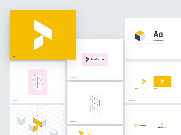
Prodactive, logo manual
We wanted our logo to have a friendly and approachable vibe, while still conveying professionalism and modernity. That's why we chose a clean and modern sans-serif font. Its sleek and contemporary appearance strikes the perfect balance between readability and a touch of tech-savviness. We also adjusted the character spacing and weight to achieve optimal visual balance, ensuring a warm and inviting look.
Colors play a significant role in evoking emotions and setting the right tone. Our color palette is carefully curated to represent the essence of our application. We opted for vibrant and energetic colors that inspire dynamism and productivity. The primary color signifies efficiency and progress, while the secondary colors provide delightful accents that enhance our overall brand identity. Our color scheme is designed to catch your eye and create a lasting impression.
Just like our application, our logo is incredibly adaptable and scalable. It can seamlessly fit across various platforms and sizes without losing its visual integrity. Whether it's on a small mobile screen or a large billboard, our logo remains crisp and recognizable. We can even create simplified versions for smaller applications or monochromatic versions for print materials. This flexibility ensures consistent branding and makes our logo versatile for any occasion.
We’re available for new projects! Learn more at Merixstudio.
---
Show us some love and press “L”. Want to see more projects? Visit our profile and follow us.

