Posh Magazine v5: Longform Layout
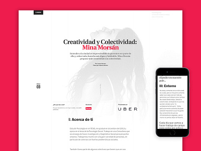
This is a longform-type post layout design for Posh Magazine, a trends and thinking exploration magazine from Guadalajara.
The main idea is to have different proportions for the grid on different resolutions and devices (there's an almost invisible very-light-grayed 5 column grid in there).
On desktop the content (text, images, quotes; everything) is aligned on a fluid centered column that has options for some irregular columns and overflows, specially with images and big quotes, making the layout more dynamic.
When it comes to the mobile device, a simple route was taken: Everything in one column, better spacing and leading for the text and nothing else.
More by WELOVECORNER View profile
Like


