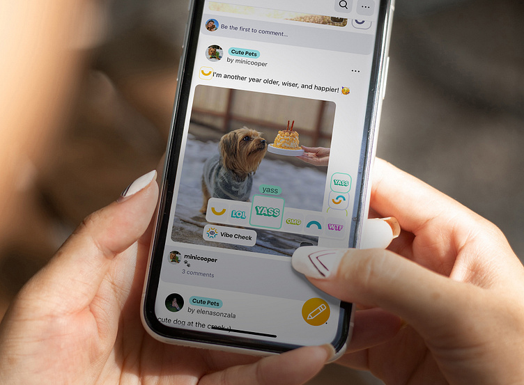
Improving engagement rate
The design process behind Visva’s Vibes as reactions to support Visva's mission to connect with people in a meaningful way, without the usual pressures of social media.
Problem:
New users do not interact with the content
Only 18% of users reacted to a post after reading it, and improving these metrics by 15% could significantly shorten the learning curve of the AI and lead to a positive change for the business overall.
Goal:
Improve engagement* rate with posts via reactions
* Engagement — the percentage of people who leave a reaction after reading a post.
The percentage of people who leave a reaction after reading a post was the primary success metric I was relying on. Also, it's easy to track, It's measurable, and precise.
User Story:
“As a person for whom social media is the main channel of communication, I want to reveal my feelings through the product's interface to express myself openly and make meaningful connections with people.”
User Problem:
“👏” doesn’t represent emotional connection
Process
As a team, we did a few brainstorms and came up with the idea of using Gen Z slang as the platform reactions. Because what can be more relevant to them than the language they invented, right?
UNIQUE VIBES
Having the list of the most popular slang words and phrases using by teenagers, I worked with our illustrator to create a set of images for these reactions.
We started to call them Vibes.
CARD SORTING SESSION
I did a card sorting session to find out what vibes are essential and speak with the audience.
I made these cards and printed them out. I sat with teens in the same room and observed their behavior. I asked session participants to describe each Vibe by the illustration on the front side. Then they could read the description we came up with as a team on the backside.
I established favorites based on the insides from that session. These six illustrations went further in the process to become Visva vibes.
MID-STAGE REVIEW
To evaluate the proposed solution, I tested an interactive prototype. My biggest surprise was how this layout affected users' understanding of the platform.
People started comparing it with other popular social media and, more critically, expecting to see the same features.
Visva lost its uniqueness. I had to step back to the ideation process and develop a different solution for the layout.
IDEATION
There were a lot of experiments. My goal was to make it Unique, Useful, and Playful. And I found a middle ground: Inside the post sells, the three most commonly selected vibes will appear beside the default vibe button.
With that layout, the app is easy to scan and visually illustrates the platform concept that values users' emotions. As somebody who is just scanning the feed at a glance, you could understand the general sentiment of how people are vibing to the story. The layout was approved for further polish.
DESIGN DELIVERABLES
I did a few design tradeoffs to make this layout work for each post type supported by the platform.
To display the top 3 vibes, I need a minimum fixed post cell height.
It affected the second tradeoff - the aspect ratio of a landscape image. We hide about 11% of the image on the sides to fit the post layout.
And the third one is dedicated to small text post cell design. I call it a design tradeoff because it causes more developers time to implement new requirements.
Each tradeoff was discussed with the PM and Developers for approval.
RESULT
Engagement increased by 27%
* from 18% to 45%
My initial goal was to improve post-reaction retention by 15%. Four months after the new design was released, we saw an increase in people leaving reactions from 18% to 45%. That means almost half of the users leave a reaction after reading a post. That is almost twice better than my initial goal required by the business. So I call this change very successful.


