Design System Foundation
In the early stages of the Visva redesign, I struggled with the new demands for the new visual brand language to be consistent across all platforms and simultaneously be flexible and adaptive. I approached it with a system and defined design patterns early on.

I was creating it to fit into the workflow of users - other team members:
Other designers to define the visual elements of the system to ensure our system conforms to standards like WCAG
Fron-end developers create modular, efficient code
Content Strategists/Marketing who helped the team to maintain the voice and tone of the product
Product managers to ensure we are aligned with customer and business needs
There are two types of interface inventories to be created:
An inventory of the visual attributes (such as spacing, color, and typography) will help us create a codified visual language
An inventory of each UI element (such as buttons, cards, and models) will help us create a UI library of components
Design Language
I ensured that the visual look gives product visitors a feel for the atmosphere and personality of the platform. That our product used the correct language and tone, making using the app relatable and enjoyable. That was important because Teens often complain that adults are out of touch and don't understand their situations.
CREATING A VISUAL INVENTORY
I analyzed the key screen of a redesigned product to see how many unique colors, font sizes, and font families I have. It was a great way to see where I could merge or remove some variety initially, not to blow the design out.
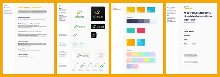
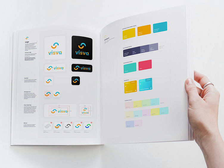
Design Kit
I maintained the design kit in Sketch, creating the UI library for the design system. The kit comprises the components, styles, symbols, and visual/UX design. To maintain consistency, updates to the design kit are reflected in the component library, the code in the developer sandbox, and the documentation.
COLORS
Visva Design System includes two primary colors that represent the brand. Turquoise brand color works great as a link, and yellow is used as the primary button background. It makes it easier for users to recognize interactive elements and create a connection with the brand.
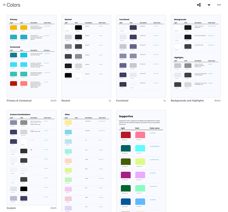
Colors I choose for the Visva design system are more than just an extension of the brand. The UI uses colors to convey:
Feedback: Error and success states
Information: Charts, Graphs, and types of Reaction
Hierarchy: Showing structured order through color and typography
There are colors for states such as error, focus, warning, and success.
To manage colors with accessibility in mind, I checked all colors in different modes to be sure we have enough contrast between colors that are usually there as a pair
TYPOGRAPHY
As fonts have a high impact on the brand and user experience, I kept legibility in mind when selecting the right fonts. I decided to keep standard system fonts for text bodies San Francisco for iOS and Open Sans for Wed as they are familiar to the user’s eye and natively support dynamic font sizes to improve accessibility.
I kept legibility in mind when selecting the right fonts
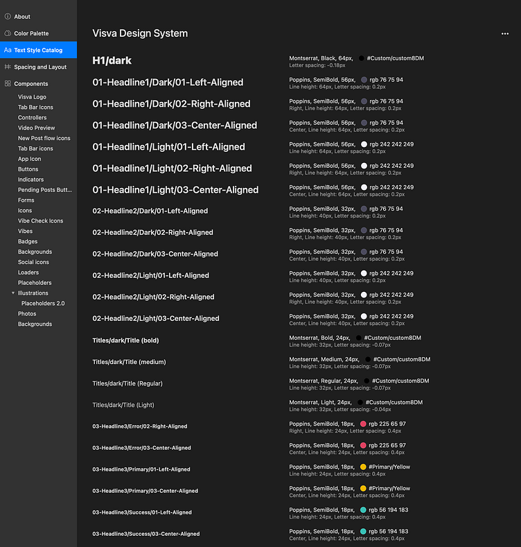
When selecting the size to set to the type, I like using 16px as it works with 4-based metrics used by Apple and Google. For larger and smaller font sizes for other elements, I used a modular scale where 16 is the base number and ratio to generate the following number.
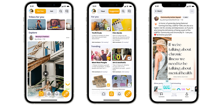
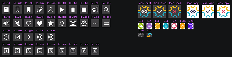
IMAGES
The Visva design system has two slightly different styles for icons. Utility and action icons (like settings, notifications, etc.) are SF Symbols Font 1 color icons, and brand-custom features are multicolored and more creative.
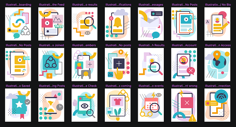
For the empty states, loading screens, modals, and other components that invite visual interest illustrations are a great way to add character to the product
I worked with a Graphic designer to produce unique illustrations for all the empty states of the Visva platform, with conveyed a strong sense of brand personality.
Component Library
The center of a design system is the component library. I used Zeplin to set and communicate across teams building blocks for apps and webpages.
I divided the pieces into elements, components, regions, utilities, and so on, following Atomic Design as a conceptual model
Atoms (or Elements) are small, stand-alone components like buttons and icons.
Molecules (or Components) – these are an assembly of small components into a larger component like a search form (which includes a form input, a button, and a search icon).
Organisms – these are an area of the UI like left-hand navigation.
Layouts – how the pieces are laid out on the page (like a header region, followed by a sidebar and main content area, followed by a footer)
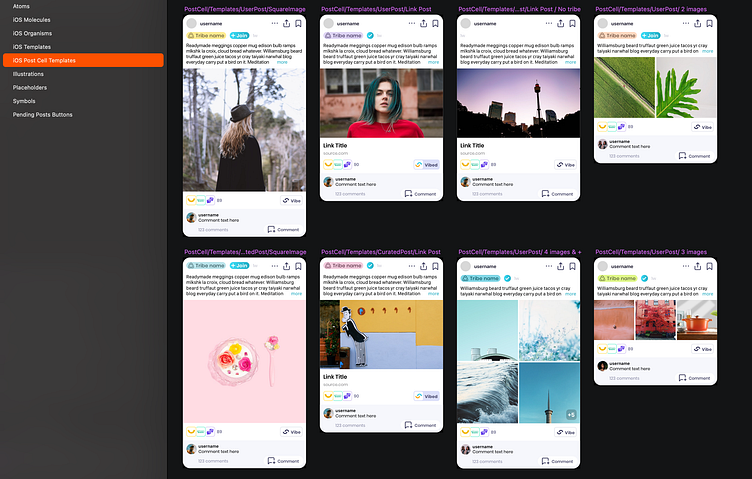
These pre-built components saved designers, developers, and QA professionals a lot of time, letting them focus on the overall goals of the build rather than the small details of creating each element.
Creating a design system helped my team produce a more consistent user experience and built a stronger bridge between design and development. By creating a common visual language codified through design tokens and a set of components and patterns cataloged in a UI library, I also gained fine-tuned control of the UI in a manageable, scalable, and robust way.