Uncovering Teen's Needs
Visual Interface direction for Visva, an AI-powered way to create and manage membership-based collaborative communities for teenagers.
User Interviews & Testing
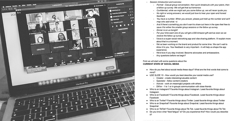
To understand the expectations of a generation that grew up with technology and the internet, I conducted usability studies with real teens to identify specific guidelines for how Visva can be improved to match teenagers' preferences and needs. These interviews included an initial survey, a live user test, where teenagers were invited to interact with content, and a final set of questions.
One of the deal-breaking factors for retention drops off — teens felt the current app's design was too boring and formal
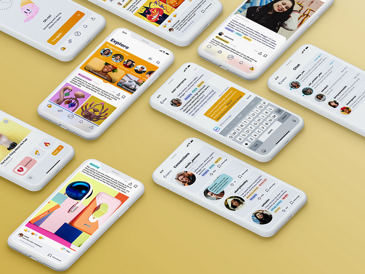
I made different styles capes to see which design language they prefer
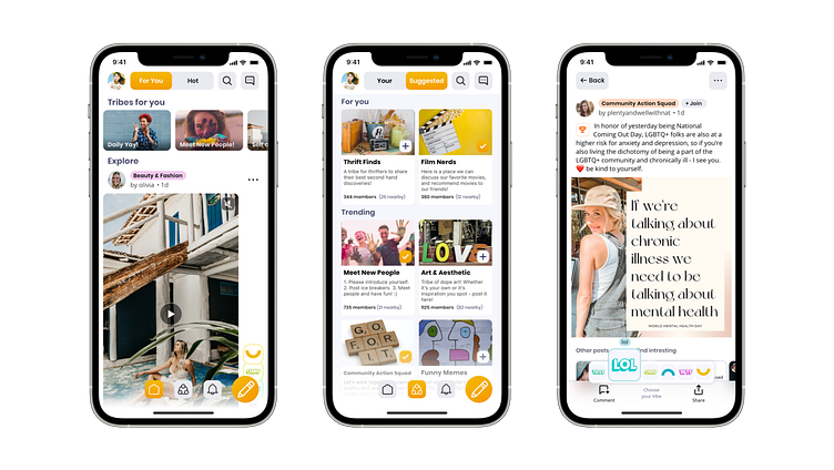
Participants preferred bright, playful designs with vibrant accents.
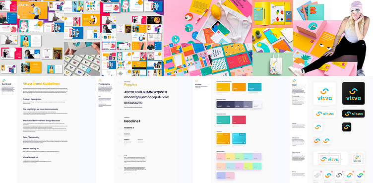
Based on the feedback, I started working on the visual language of a bran new look of the product.
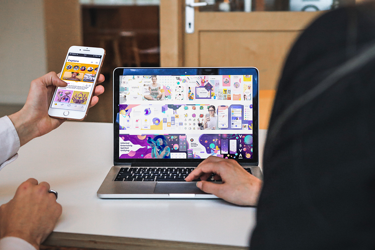
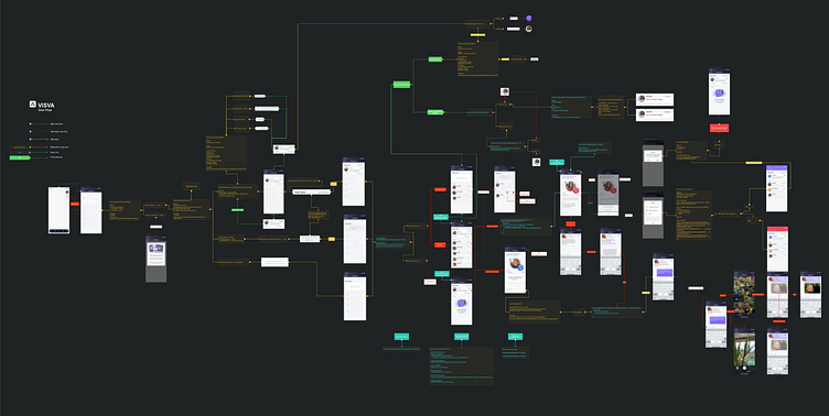
Once the design language was done, I was able to build a blueprint of our design structure — The road map for the redesign.
The new visual look gives app visitors a feel for the atmosphere and personality of the platform
Results
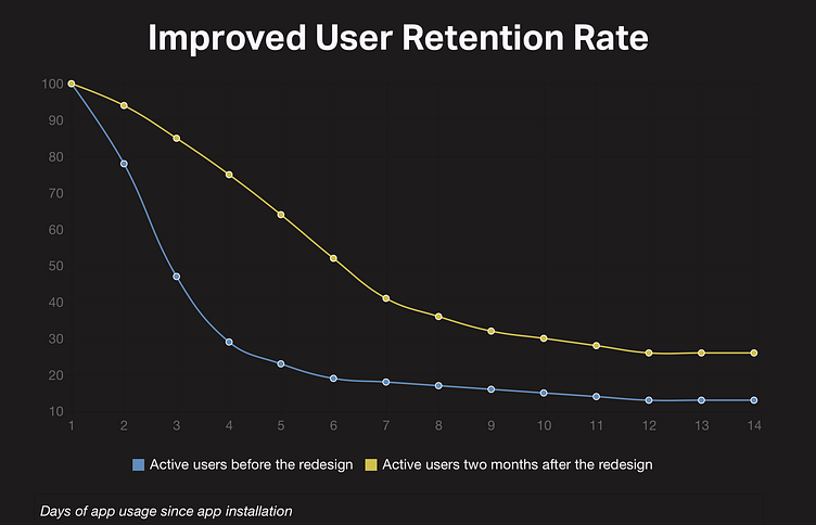
We can see a dramatic difference between how it was before I started and how it ended up after the redesign
The major difference that was beneficial for the business is these first few days of the app usage. After the redesign, We were able to hold people in the app long enough to start providing relevant to them content and convert them to long-term users as a result.