IT Business modern branding logo green sustainable
Ascending triangles: the evolution of OfficeGrip's digital identity through symbolic logo design
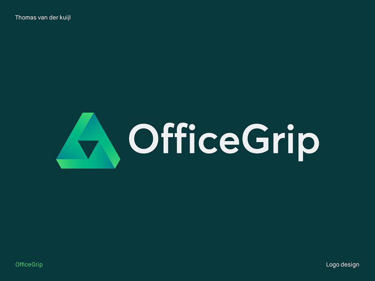
In crafting the logo for OfficeGrip, I set out with the understanding that I was not simply creating an image. Rather, I was encapsulating the ethos and brand philosophy of a company that prides itself on its unwavering commitment to delivering superior and tailored digital solutions. Every element of the logo, from the abstract triangular form to the color gradient, was thoughtfully and meticulously designed to symbolize the unique values that OfficeGrip represents.
The abstract triangular form was chosen due to its inherent strength and stability. The three sides represent the three fundamental principles OfficeGrip stands for: dedication, clarity, and personal engagement. Just as the triangle is the simplest polygon that can exist in three dimensions, OfficeGrip aims to simplify the complex digital landscape for its clients, providing a robust, three-dimensional service that encapsulates all their needs.
The color choice of green was a deliberate one. As a color, green is often associated with growth, freshness, and creativity. By employing a gradient from bright to dark green, we were able to convey the notion of digital transformation OfficeGrip provides to its clients - beginning with fresh, innovative ideas and moving towards mature, sustainable solutions. The color choice symbolizes OfficeGrip's mission to elevate their clients' IT, from nascent stages to a level of profound growth and development.
The chosen font is a modern sans-serif, representing OfficeGrip's forward-thinking approach. This typography, sleek and clean, echoes the company's commitment to clarity and straightforward communication. Sans-serif fonts, with their absence of ornamental strokes, suggest efficiency and contemporary design, mirroring OfficeGrip's dedication to staying updated with the latest technologies.
The resulting logo embodies the slogan "Elevate your IT together". It suggests a journey of ascension - the triangular form pointing upward - and a pathway to success illuminated by the gradient of green. The logo is more than a symbol. It's a visual narrative of OfficeGrip's commitment to their clients, their relentless pursuit of customer satisfaction, and their promise to "underpromise, overdeliver".
___________________________________________________________________________________
Let's team up and elevate your brand with Dutch Design!
Don't hesitate to get in touch with me via E-mail:
🚀 info@thomasvanderkuijl.com
💼 Let's link up on LinkedIn and take our professional networks to the next level!
📷 Join the Insta-party and catch my latest projects today!
