Logo | Creating process


In the whole process of creating a logo, the stage presented here is not the first one, but in terms of visuals, it is the first. After briefing the client, collecting information, analyzing the market, competitors, and numerous sketches, I found several options that would potentially best suit the company.

In this post, I want to show you all the options and introduce you to the company

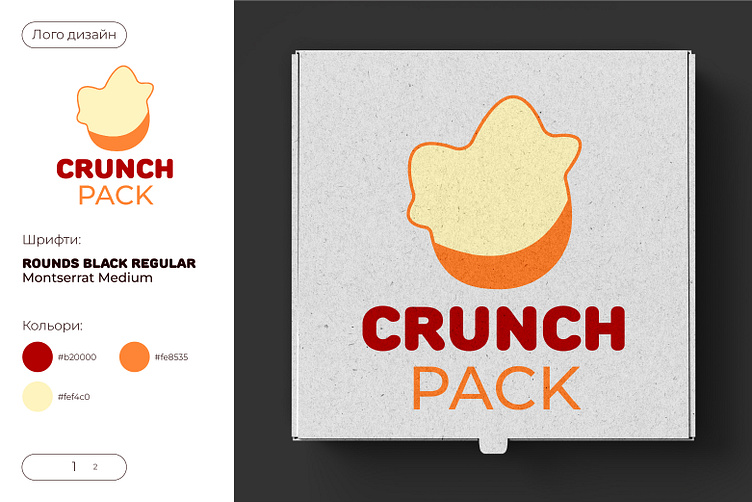
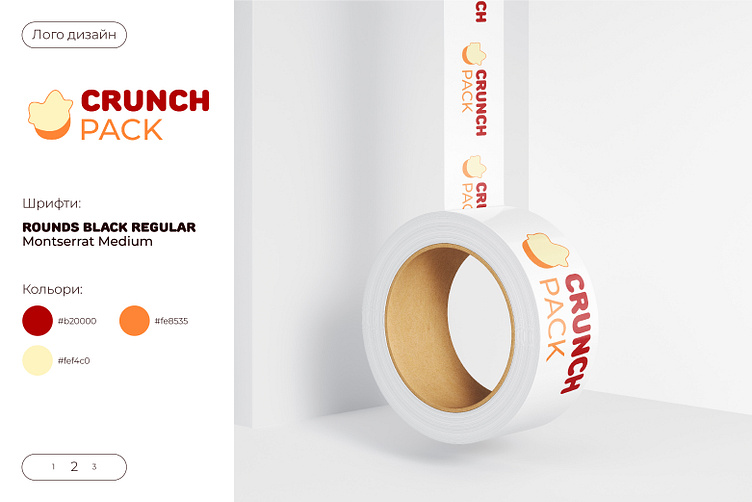
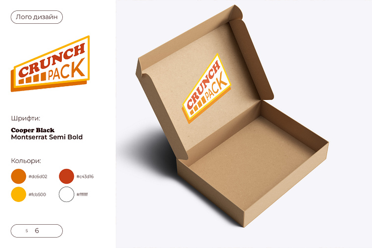
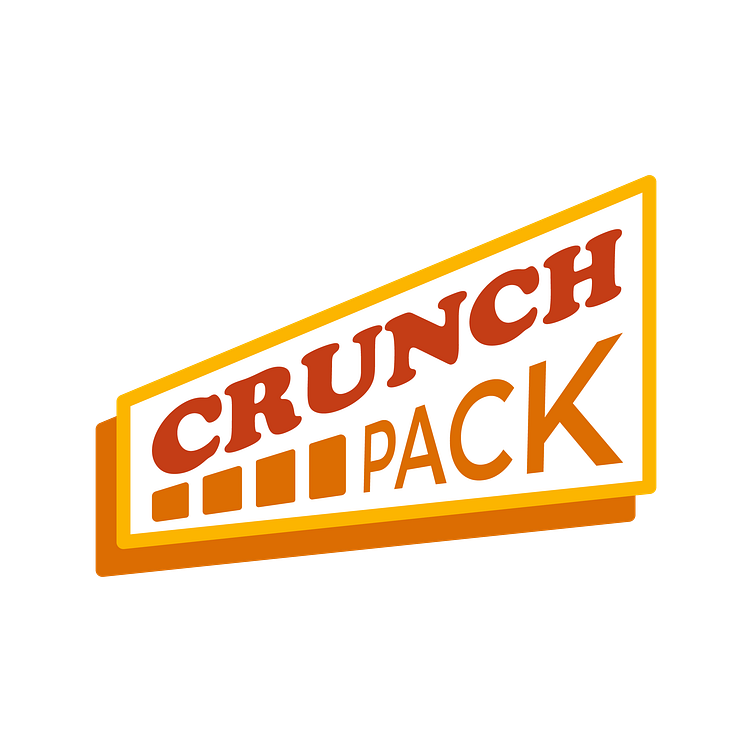
CrunchPack specializes in the production of crunchy snacks such as chips, popcorn, corn sticks, and nut bars. All these products are made by frying, so the first thing that came to mind was the color scheme (gold, brown, yellow, orange).
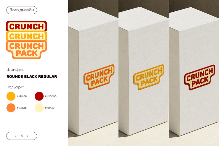
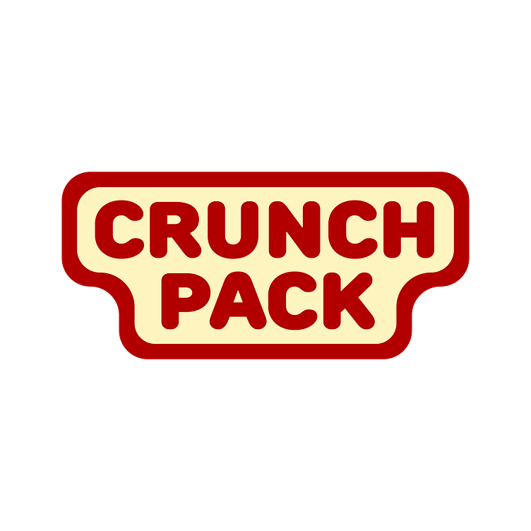


The company positions its product as fun, for parties, associated with relaxation, desire, and students. This became the basis of the logo concept. It reflects lightness and pleasure at the same time. The round font in combination with the illustration best shows these values.
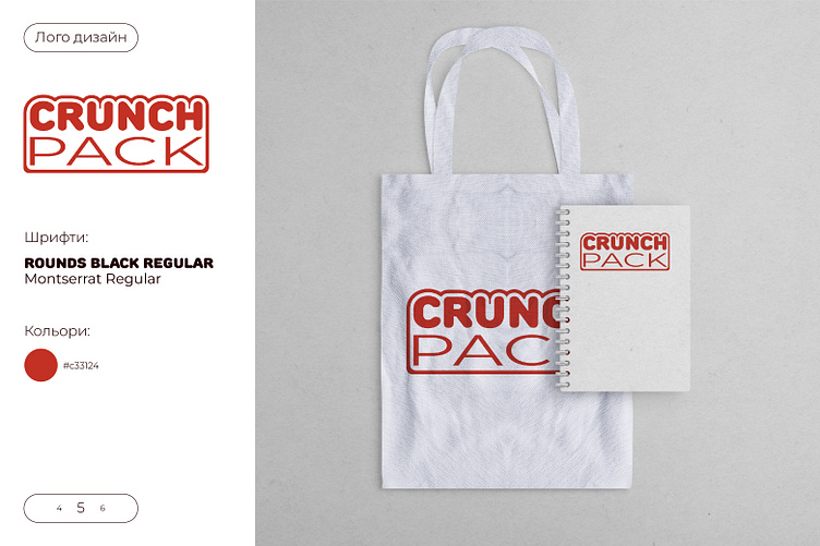
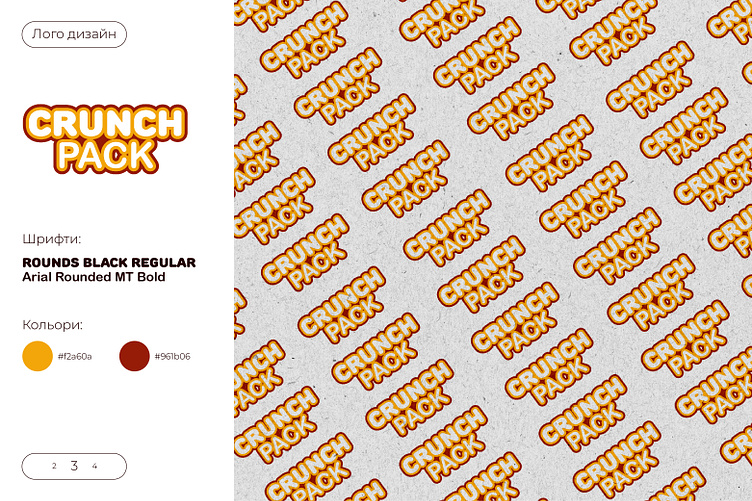
After creating several versions of the logo, I conducted a survey among ordinary Internet users. It turned out that options 1, 2, and 4 were the most attractive and understandable.
Thanks to the survey, I selected 3 variants of the logo and started creating a snack packaging design. But this will be in the next post. While creating the packaging design, you will be able to see which logo suits the company best.
Thank you for your attention.
You can write about cooperation here: yxx0908@gmail.com