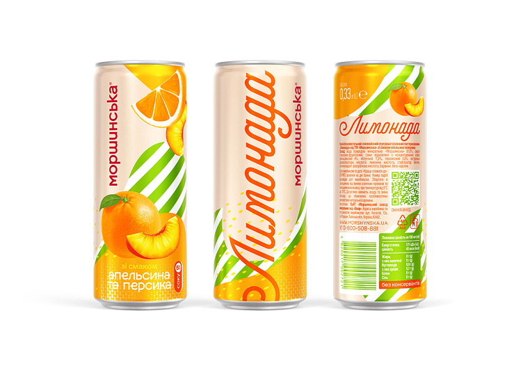
Morshynska «Lymonada»
The design composition of the front labels on the bottles follows a more classic arrangement of design elements, with the brand and product name placed together horizontally. On the can, the brand logo is displayed prominently, while the product name is placed outside the visible area of the packaging. This decision allows for a larger and more noticeable product name, as well as more interesting merchandising opportunities.
More by Reynolds and Reyner View profile
Like
