Brand Identity for Temecula Valley Children's Ministry

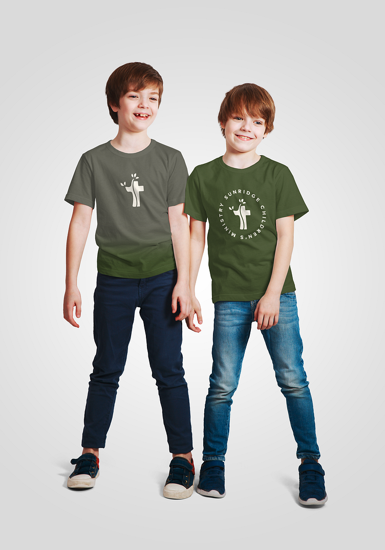
Brand identity for the Children's Ministry of Temecula Valley's Sunridge Church. The logo mark symbolizes the children's sprouting, growing faith. The logo mark was designed with multiple uses in mind, including the ability to change the background color to represent each age group within the ministry, while remaining consistent as a brand overall. The color palette both compliment's the church's primary palette, while also helping the Children's Ministry in establishing a visual identity of its own. The color palette also allows for flexibility in use for both young boys and girls, as shown in the two graphic tee mockups.