StrategyCorp
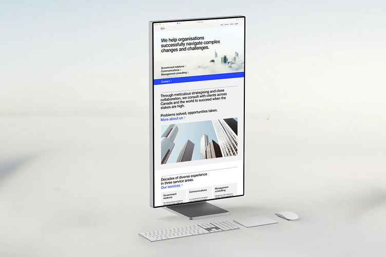
We recently designed and developed a new website for StrategyCorp.
A strategic advisory and management consulting firm with clients around the world, from government bodies to 7-Eleven, our job was to create a site that properly represented them and their reputation.
They felt their previous site was dating the brand, underselling them, and wasn’t very easy to use nor very clear in explaining what they did. Instead, they were looking for a site that elevated them above their competition and made it simple to explore and understand the company.
So, we set about designing, writing, and building an intuitive website that reflected who they were, and presented information with clarity and purpose.
We kicked things off with a slight update to their visual identity. To make their brand feel more contemporary, we had to make sure we had the right tools to design the website.
We explored secondary typefaces and additional colours, and added a couple of options that stayed true to their existing brand while giving us the flexibility to modernise it.
From here, we worked with StrategyCorp to hone in on an approach that balanced feeling fresh and more modern with seriousness and professionalism.
Another big part of this new website was our approach to imagery. Visual content is crucial on any site, and we wanted to avoid using stock imagery which would make us feel generic.
So, we used Dalle 2 to generate a series of AI illustrations, thoughtfully using the tool to create a consistent art style that could be an ownable aesthetic for StrategyCorp.
See more of our work at: fookcommunications.com


