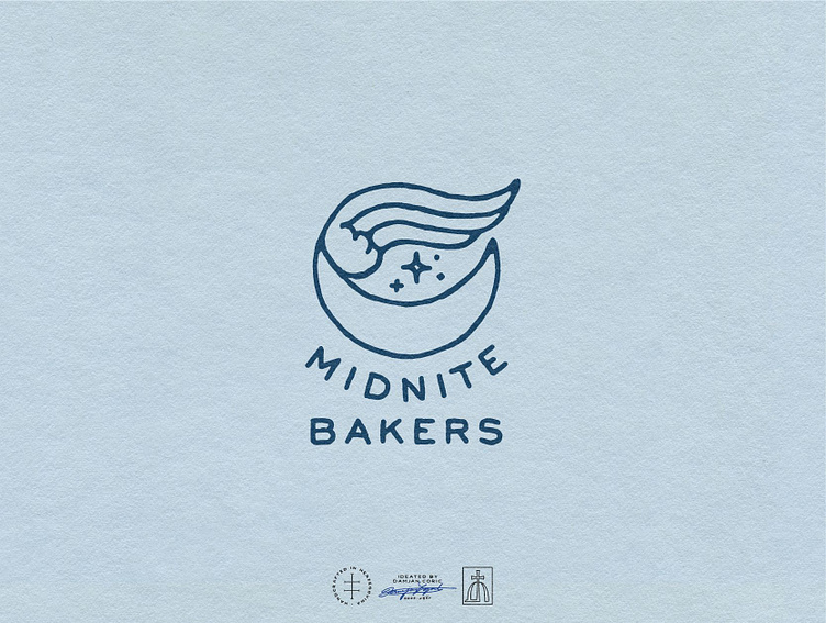
Midnite Bakers
🏴 Logo design for a San Diego bakery run by two moms who bake at night to provide for their daughters’ education.
The client envisioned a minimal logo with a subtle mystical feel that will help the brand position itself as a simple bakery that offers a few great quality products and stand out in a saturated market full of hipster bakeries that offer gluten-free and vegan items.
🌙 I created a combination mark based around the moon and a wing. The moon symbolizes mystery and complements the brand name to increase brand recognition and promote memorability. The wing belongs to a stork, the symbol of a parent's love and devotion to children.
For the typography, we settled on a simple sans serif to convey approachability and give the design a more modern feel. The color palette consists of dark blue and powder blue for a soft, feminine feel that differentiates the brand from the competition 🥨
Once the master logo was finalized, I developed the concept into a logo suite with a secondary and tertiary mark, pictorial marks, monograms, and wordmarks.
⭐️ Follow me for daily design inspiration!
