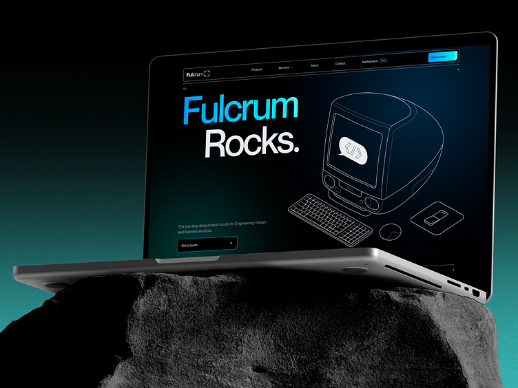
Fulcrum Rocks® - Website redesign / Web design / Main page
Meet Fulcrum 2.0, and it’s legen-wait-for-it-dary! (said in a Barney’s voice).
We have completely changed our own branding and redesigned our website. You won’t believe what a challenge it was (how many tears we have cried, how much coffee & Red Bulls it took) but at least it made for a nice case study!
What’s our approach?
The main page of the website was designed with the best practices of user interface and user experience in mind. It was crafted to provide easy navigation and an intuitively understandable structure for visitors.
However, the Fulcrum Rocks homepage not only had visual appeal but also offered valuable information and functionality. It showcased the core services and products offered by the website, as well as displayed customer reviews and success stories.
The team paid special attention to selecting content that effectively conveyed the value and expertise of Fulcrum Rocks.
Thus, the creation of the main web page for the Fulcrum Rocks website was the result of creative collaboration and keen attention to detail. It became the company's business card and an invitation for users to dive into the unique world of knowledge and opportunities offered by Fulcrum Rocks.
How to work with Fulcrum?
It’s easy and you will love it.
1. Visit our website: https://fulcrum.rocks
2. Send us a message: hello@fulcrum.rocks
