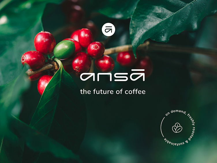
ansā - Art direction
ansā offers an alternative solution to industrial coffee roasting. With the micro-roaster and their specialty green coffee beans, ansā provides an ideal solution for workplaces prioritizing the freshness and quality of their coffee while showcasing a commitment to the environment.
As their Art Director, my responsibilities encompass various aspects, including brand strategy and concept development, rebranding, designing a new website, creating visually appealing packaging for the green coffee beans, overseeing a Kickstarter crowdfunding campaign, and providing guidance on all visual elements, including the design of their roasting machine.
Additionally, I have also been involved as their product designer, working on a mobile app that connects to the coffee roasting machine. I have been collaborating with ansā for three years.
Mobile App Design
ansa's machines feature a specialized mobile web app, enabling remote connectivity to the micro-roasters. Here are my proposed designs for the primary screens, based on the existing app. The design maintains consistency with the brand's colors and guidelines, embodying a clean and tech-oriented vibe. The dark screens provide a real-time camera feed showcasing the roasting process inside the bean plate machine.
The name "ansā" derives from a Japanese term adopted from English, signifying "answer," specifically aiming to provide a superior coffee experience.
The brand's concept revolves around non-industrial roasting and promoting environmental consciousness, with a logo composed of gentle and curved forms that evoke a connection to the natural realm. The color scheme and additional visual elements further reinforce the brand's values of excellence, freshness, sustainability, and openness.
Branding Challenges
Firstly, there was a need to connect and harmonize two seemingly opposite worlds - the sensory and romantic coffee world with the world of technology. The challenge was to create a brand that seamlessly integrates both aspects.
Additionally, in the visually rich and saturated coffee industry, standing out and being original was crucial. The design of a custom logotype with unique lettering was employed to achieve a memorable and distinctive look.
To convey a non-industrial story, the logotype was clean and crafted from a self-created font, featuring round and soft shapes inspired by the natural world. The lowercase letters evoke a boutique, sustainable, and precise image.
In addition to the logotype, a symbol was developed to act as a seal of quality and high standards for the coffee and its raw materials.
Materials, shapes, and colors associated with the industrial world were intentionally avoided throughout the design process. Instead, the focus was on elements that conveyed a soft, green, natural, boutique, and fundamental message.
Visual inspirations included coffee-related concepts like jute fabrics, natural wood, biodegradable packaging papers, and the origin of coffee beans. From these inspirations, a color palette was derived to create a visual language that captures the brand's essence.
Homepage design
single - a personal micro roaster
Single ansā marks the debut of a new personal micro-roaster, set to launch on Kickstarter. In preparation for this launch, I made minor adaptations to the single branding under the ansā umbrella. I oversaw the art direction for a video photoshoot, ensuring everything adhered to the brand guidelines. Additionally, I took on the responsibility of managing everything related to the Kickstarter campaign, including the design of the pre-launch landing page and the campaign page on the Kickstarter platform.
single machine design
As ansā's art director, I collaborate with Tamooz, an industrial design company tasked with creating the single machine. My role involves ensuring that Tamooz comprehends the brand guidelines, selecting colors for the machine, and providing any necessary information or materials they may need.
Here's a glimpse of Tamooz's sketches and designs with which I collaborated.
ansā's concept store
ansā's coffee concept store has launched in the vibrant heart of New York City, at 827 Broadway. The visitors are in for a unique experience: immerse in the meticulous craftsmanship and eco-conscious design that defines ansā. Engage in coffee cupping workshops and enjoy a curated exhibition showcasing diverse artists. There is one place in the store that has a big wall with sketches and inspirations from the branding design process that I did, adding an element of behind-the-scenes insight to the experience.
Every aspect of the store, from its design to its contents, reflects the branding and guidelines that I meticulously crafted. This results in a distinctive and branded ambiance that permeates every detail.
Sub-brands
As the art director and brand manager, I spearheaded the development and execution of the ansā sub-brand strategy.
To introduce our innovative "Single" roasting machine, which caters to personal and home use, we launched a Kickstarter campaign and established a concept store in New York. It was crucial to distinguish our three primary ansā products: Single, Variety, and green coffee beans. In addition to designing distinct logos for each sub-brand, I carefully considered how they would be represented across various formats and media channels. This involved incorporating them into digital marketing materials, machine displays, signage within the concept store, coffee packaging, and more. I collaborated closely with strategic partners, including entrepreneurs and the marketing manager, to make informed decisions throughout this process.


