ehouse - Product Design & Rebranding
ehouse is an all-in-one workspace tailored to streamline day-to-day operations and maximize eCommerce growth: flexible storage units, efficient deliveries, fulfillment services, a thriving community, and more.
ehouse landing page: www.joinehouse.com
As a product designer, my primary goal was to elevate user experience and interface quality across both desktop and mobile platforms. Being an integral part of the R&D team, I actively contributed throughout the design journey, from research, initial inspiration and concept creation to wireframing, crafting pixel-perfect UI, and delivering assets for development.
Flow #1: Mobile App Onboarding
This video showcases the mobile onboarding process for new users. First, users fill in general details such as name, email, and location, along with information about their business needs. Then, they select the pricing plan they require, proceed to an external payment app, and finally receive a success screen with actionable buttons.
Flow #2: Streamlining Orders to Shipments
This video demonstrates the primary flow in the app: relocating the business order tab to the shipment tab in the fulfillment area. Users can select multiple orders (one, some, or all), then either approve or change the courier company for each order or a group of orders. They can also view the delivery cost in eCredits terms before approving and moving orders to shipments. The experience is designed to be simple and mobile friendly.
Mobile App Main Screens
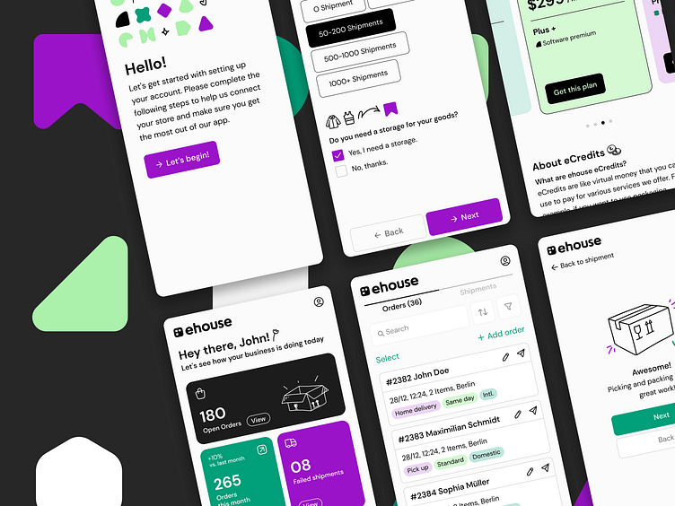
These are some screens from the mobile app, including:
Dashboard screen, providing business data and insights
Orders screens, organized as cards in the fulfillments section
View and edit order screens
Courier company screens in the streamlining orders to shipments flow
Shipments screens organized as cards
View and edit shipments screen
Shipment tracking bar
Here are additional main screens from the app:
Pick & pack solution flow
Packaging materials order flow
Prototyping
I've developed an interactive prototype that lets you experience the product directly. I've tested the prototype while working on the design and allowed other team members and ehouse clients to use it before proceeding to development. Explore the prototype using this link.
Product Design Challenges
Adapting content from desktop to mobile posed challenges due to text-heavy content and objects like tables, which are less suitable for smaller mobile screens. To address this, I proposed a card-based design approach that required significant content reduction, focusing on the most relevant information for mobile users. The order table details, such as package size, country, and payment status, were condensed, and additional status tags for delivery method, timeframe, and international or domestic shipping were introduced. Furthermore, sorting options for orders were implemented.
Streamlining the creation and editing of orders on mobile: The screen for creating new orders or editing existing ones contained numerous details specific to each order. In the mobile format, an infinite scroll was implemented. To enhance usability, I categorized the fields and details into several sections, each with a collapsible title. Users could expand each section by clicking on its title, revealing the associated details. This approach simplified navigation, created visual order amidst a screen filled with details, and facilitated changes to existing orders or the creation of new ones.
The concept and visuals embody the brand's core values of variety and flexibility, showcased through various forms symbolizing the multiple services offered. The logo represents a square wallet integrating three core solutions: shipping, storage, and marketing consulting services.
Branding Challenges
Transforming the perception of logistics and operation: The worlds of logistics and operation are often perceived as heavy, outdated, and dull. My challenge was to break away from the conventional design patterns associated with these fields and infuse them with lightness, fun, and emotion. I aimed to introduce an aesthetic appeal and a sense of excitement into ehouse branding.
Communicating the diverse range of services concisely: The main branding challenge was to effectively convey what ehouse does and highlight the wide variety of services it offers concisely and straightforwardly. I focused on positioning ehouse as an all-in-one solution and translated its service portfolio into a formal and colorful solution index. Each form in the index represents a specific solution provided by ehouse, such as delivery, packaging, studio, community, and digital platform. To clarify, I categorized all services into three main groups: shipping, storage, and marketing consulting services. Each category was assigned a distinct color. The index, consisting of engaging and enjoyable graphic shapes, is a central element of the graphic language. Each shape symbolizes a specific solution, consistently used across marketing materials, digital platforms, and other brand touchpoints.
Highlighting the digital dimension of ehouse: Previously, ehouse emphasized its physical dimensions, including storage, co-working spaces, deliveries, and packaging, among others. However, it became crucial to emphasize the digital dimension provided by ehouse - a comprehensive digital platform for business management that enables entrepreneurs to focus on business growth rather than logistics. As a customer, one can benefit from ehouse's services without being physically present or renting a space.
Animations in collaboration with Lamona Studio


