Brand Revamp
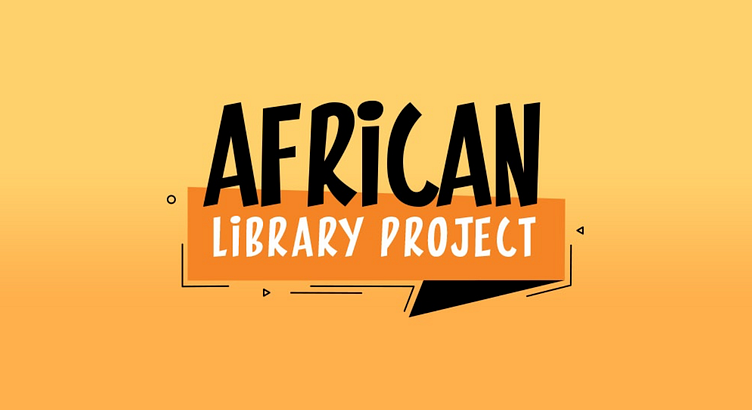
Revamping the online presence of a non-profit organization involved a complete redesign. The updated version incorporated a fresh logo, vibrant colors, and distinctive fonts. Our objective was to draw inspiration from the communities the organization served, selecting colors that resonated with their surroundings. Simultaneously, we aimed to create a font selection that embodied the brand's individuality and personal touch. Given their focus on books, the logo design took inspiration from a bookmark, symbolizing the encouragement of reading and lifelong learning.
More by Hesh Elsokary View profile
Like


