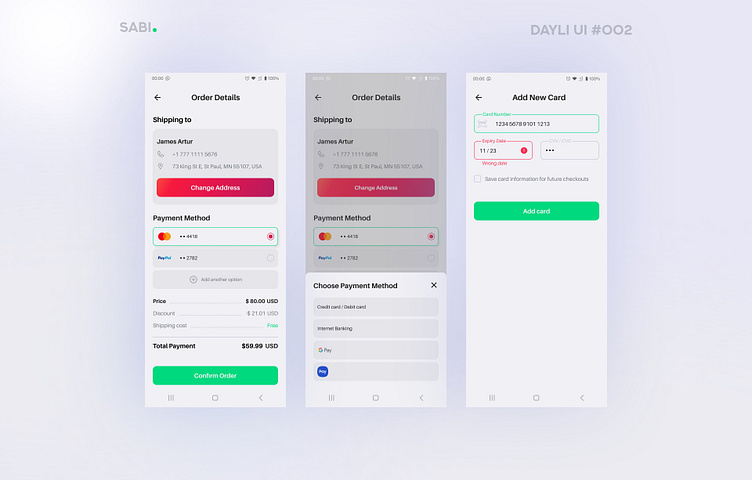
Checkout Page / Payment / Daily UI #002
Daily UI Task:
Design a credit card checkout form or page. Don't forget the important elements such as the numbers, dates, security numbers, etc.
Hello there!
Today I have created a checkout page 💳
Questions that caught me at work:
Debit or credit card?
In search of inspiration, I looked through many applications and projects of other designers. I came across such options where when adding a card you need to make a choice: debit or credit card to enter. As far as I understand, nowadays the level of application development has reached the point that when entering card data, it can determine which payment system and even which bank your card belongs to.
I assume that this leads to unnecessary actions, do you agree?
Name input field when adding a new card...
Based on the experience of applications that I use regularly, I came to the conclusion that in most cases there is no name input field, which means we get rid of unnecessary actions (perhaps some banking operations according to the policy of the bank or company cannot be carried out without this information). This question remained unresolved for me, if you know how to do it right, then please write an answer in the comments 💬
I also found a cool feature in one application. To add a card, you just need to attach it to your smartphone and it scans data via NFC. Very interesting, how this function is implemented?
🌸 Press [ L ] to support me 🌸
