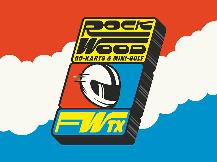
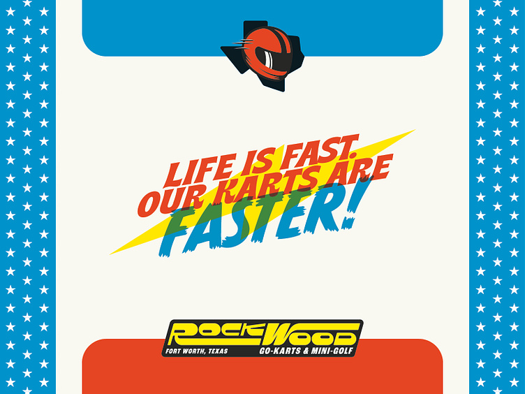
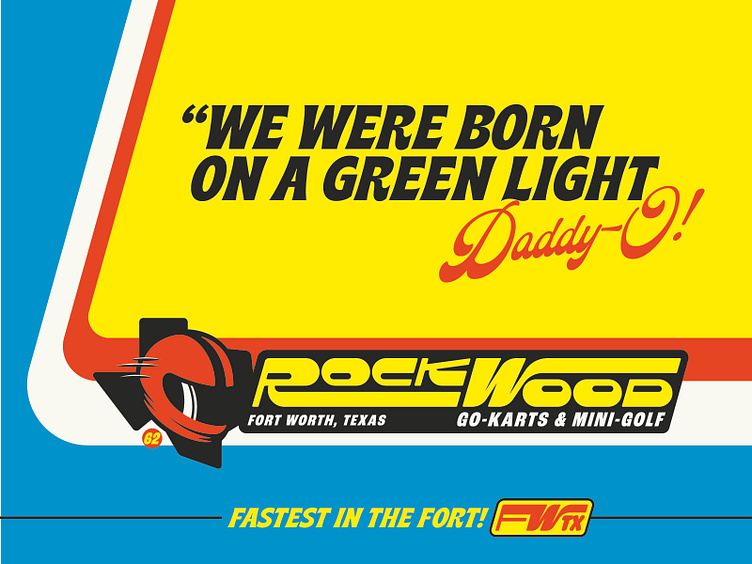
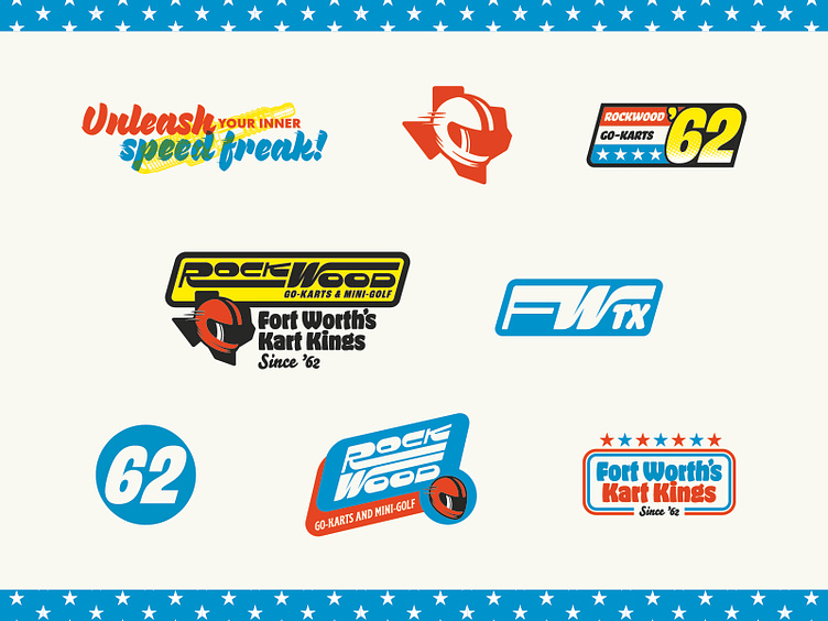
Rockwood Go-Karts Brand Identity
Sometimes you fall in love with a reject.
What you see here is an unchosen brand identity solution. The option the client chose is great and beautiful and wonderful and all those things, but this option grasped my heart and has yet to let go. I just wanted it to be out in the world in some form.
The mystery racer. The custom typography. The red, white and blue inspired by Evel Knievel and some old 60s dragster paint. Chef’s kiss.
I hope you enjoy. If you do leave a comment.