Designing RockPass: Revolutionizing Climbing Access
Understanding User Needs: Empathizing with Climbers and Gym Owners
RockPass was designed using a human-centered approach that prioritizes the needs and experiences of both climbers and gym owners. The process followed the principles of design thinking and user-centric design, ensuring that the app's design and features align with the fundamental principles of UX.
The design process began by empathizing with the target users - climbers and gym owners. Through user research and interviews, I could gain insights into users pain points, desires, and goals. Understanding the challenges faced by climbers, such as the inconvenience of managing multiple gym memberships, and the aspirations of gym owners to attract more customers, could the foundation of the design process.
Iterative Prototyping: Transforming Ideas into User-Centric Solutions
During the ideation phase, I brainstormed potential solutions and features that would address the identified user needs. Collaborative sessions and design workshops would normally be conducted to generate a wide range of ideas, but instead I mind mapped common features I would find useful. These ideas were then refined and transformed into low-fidelity prototypes, allowing for quick iterations and feedback gathering.
Prototyping played a crucial role in visualizing the app's structure and interactions. By creating wireframes and interactive prototypes, I could simulate the user flow and test various design approaches. User feedback from climbers incorporated into the evolving prototypes, ensuring that the design decisions were rooted in user preferences and expectations. provided valuable insights into the effectiveness and usability of the design.
User testing sessions allowed for the observation of user interactions, identification of pain points, and validation of design assumptions. Iterations and refinements were made based on user feedback, focusing on improving the app's usability, clarity, and overall user experience.
Implement and Launch
Once the design was refined through multiple iterations, the final visual design and UI elements were created. Careful attention was given to the app's aesthetics, typography, color scheme, and overall visual coherence, ensuring a visually pleasing and engaging experience for users.
Throughout the implementation phase, close collaboration with developers will be maintained to ensure the smooth translation of the design into a functional mobile app. Regular feedback loops and design reviews will be conducted to maintain consistency and address any technical limitations or feasibility considerations.
Conclusion: User-Centric UX Design
RockPass exemplifies the application of design thinking and user-centric design principles in creating a seamless and delightful user experience. By empathizing with climbers and gym owners, ideating and prototyping innovative solutions, testing with users, and refining the design iteratively, RockPass's features and interactions align with the needs and goals of its users.
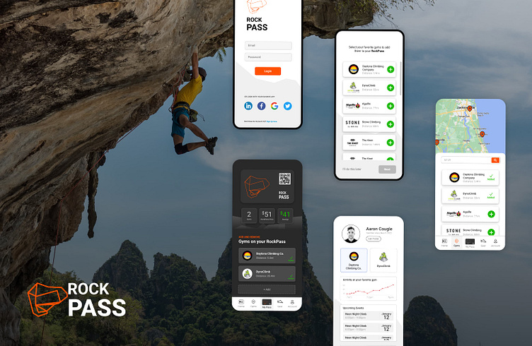
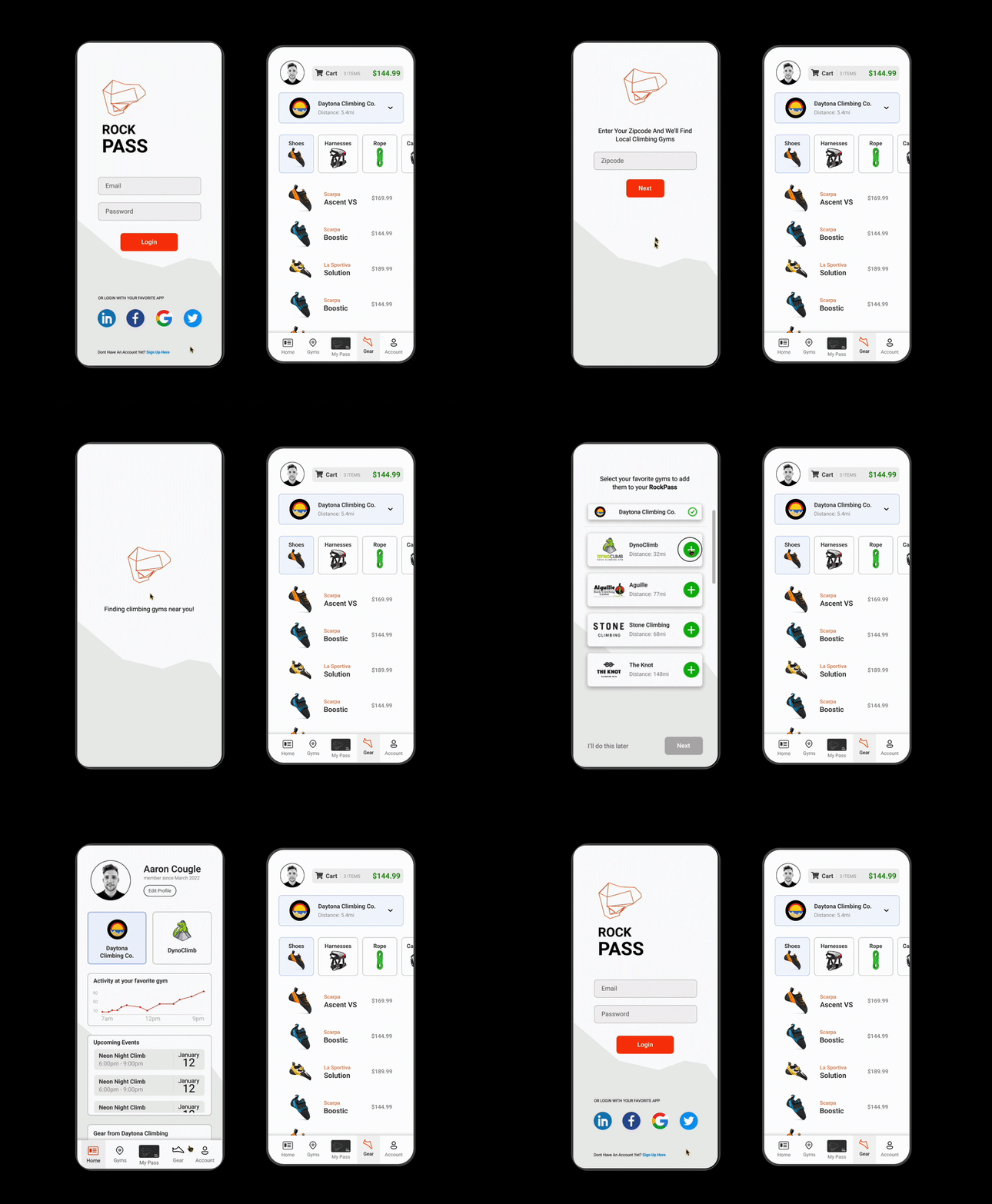
The app's interface, from the onboarding flow to the quick purchase experience and the digital check-in interface, prioritizes simplicity, ease of use, and efficiency. By providing a holistic and convenient solution, RockPass aims to empower climbers, enhance gym owners' businesses, and foster a thriving and interconnected climbing community. Through a deep understanding of user needs, RockPass embodies the core tenets of user-centric design and serves as a testament to the power of UX design in transforming experiences.


