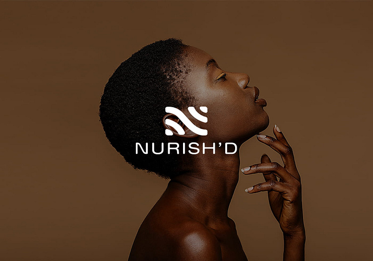
Brand Identity System for Nursh'd - A skincare brand
NURISH'D
_
Nurish'd is a Ghanaian-owned Canadian brand in the skincare industry. The company sources shea butter from Ghana to produce organic skin care products targeting people of African descent in the diaspora. The brand identity system had to be clean and simple with some subtle African feel to it.
Stylescape explorations - Part of our process was to create 3 stylescapes to get a sense of the look and feel of the brand per the discussions with the client.
_
Stylecape 1
Stylecape 1 took on a modern, sophisticated approach. It took away any excesses and focused on a premium feel. To be honest, all the discussion from the client indicated this was the look to go for but it didn't make the cut.
Stylecape 2
Stylecape 2 was more minimalistic with very subdued hues and tones. The look and feel was more for the corporate woman and a bit more formal. r text here...
Stylecape 3
Stylecape 3 was a bit of a wildcard, our discussions with the founder revealed that she was interested in the African heritage of the brand. We decided to try out this African-themed version and interestingly, that was chosen followed closely by option 1.ext here...
Sketches/Ideas
_
We took some inspiration from the pattern designs in the approved Stylescape. We wanted something hand-drawn and organic (the logo did not need geometric shapes with perfect angles and sides). These were the 9 shortlisted sketch ideas
Final Sketch
_
We settled on the sketch below, it had an organic look and was versatile in its application on various media.


