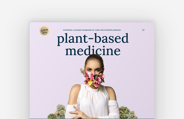
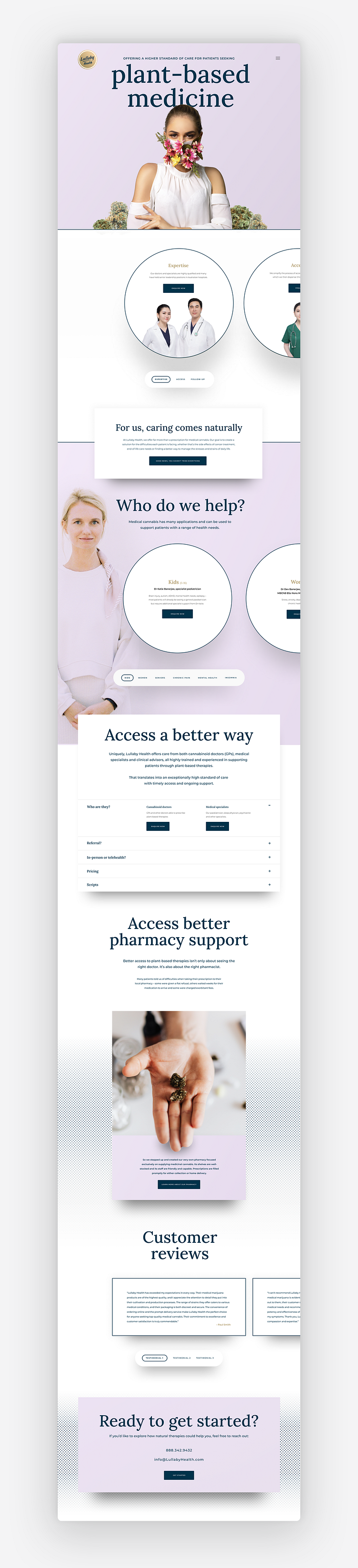
Lullaby Health
A new plant based medicine company called Lullaby Health needed a landing page concept. They wanted to avoid using cannabis leaves as a graphic/image in their designs. So I went with a different hero pic showing plants and healthcare and included a few buds in next to the figure to connect that their mostly deal with cannabis. I also used circles for the content to relate it back to the circle logo. The original color scheme was browns and tans, I introduced the purple color to contrast the tan logo and used the dark blue brand color for the headlines and text.