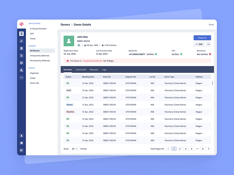
HealthTech Platform, Patient Profile Page
Hii Dribbblers,
This is in continuation of our previous shot for the HealthTech Platform.
In this shot, we dived deeper into the user profile and highlighted the sections that are of utmost importance for better clarity.
Our main focus was to improve the user-friendless of the platform. We also displayed the updated user information with different color for focused attention.
We are available for new projects!
We are experts in:
Feel free to reach out to us at: business@octet.design
For more - Look at us on Octet Design Studio
Follow us on: LinkedIn | Behance | Instagram | Twitter | Medium
More by Octet Design Studio View profile
Like
