Ampdrive — Mobile
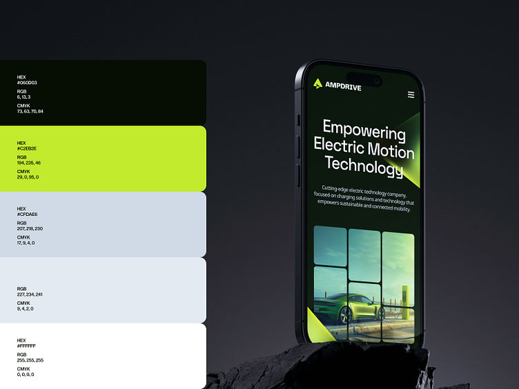
Ampdrive, a prominent electric technology company dedicated to sustainable and connected mobility, sought our partnership for the development of their visual identity, encompassing branding and responsive web design. With their resounding slogan, "Empowering Electric Motion Technology," they strive to make affordable car charging accessible to all.
Our creative endeavors encompassed distinct responsibilities. We crafted a logo that cleverly merged symbolism and purpose. An emblem emerged, seamlessly intertwining the letter "A" while forming an arrow, its gentle curve pointing towards progress—an ode to "drive."
For the homepage, we embarked on a visual narrative, capturing the essence of energy conservation and simplicity. A carefully curated color palette and style reflected these cherished values. Additionally, we incorporated a pattern reminiscent of electrical circuits, captivating photographs showcasing modern charging technology, and abstract 3D elements inspired by the logo. The careful selection of typography lent a touch of modernity.
Amidst the boundless potential that embraced the project from its inception, unforeseen circumstances intertwined with recent economic shifts altered its trajectory. This sudden change of direction left us with no choice but to discontinue further development, leaving behind only this prototype of the homepage and branding as a testament to the initial vision and aspirations.
Roles:
Visual Identity
Brand Support
UX / UI Design
--
Let’s discuss your next project.
— WE MAKE THE NEW.


