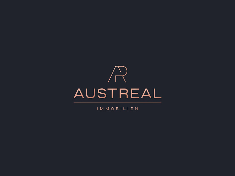
Austreal real estate logo
AUSTREAL Immobilien eU has been active on the Austrian real estate market since the beginning of 2016.
The young company, which benefits from many years of experience in the industry and continuous training of its team, has made an excellent start on the Viennese real estate scene in the year of its foundation.
***
The logo, created in 2022, was designed to showcase the company's prestige and reliability while setting it apart from its competitors. To achieve this, the color scheme of blue and rose gold was chosen for its ability to convey professionalism and trustworthiness. The client expressed great satisfaction with the outcome.
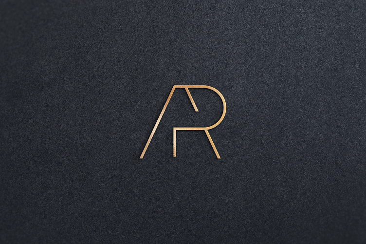
Blue and rose gold are a great color combination that evokes a sense of prestige, elegance, and professionalism. Blue is often associated with trust, reliability, and confidence, which is why it's commonly used in business and corporate branding. It also has a calming effect and can create a sense of stability and security.
Rose gold, on the other hand, is a color that exudes luxury and sophistication. It's often used in high-end branding to convey a sense of opulence and glamour. It's a softer, more subtle shade of gold, with a hint of pink, which makes it stand out from traditional gold and silver tones.
Together, blue and rose gold create a perfect balance of strength and beauty, reflecting the company's commitment to providing reliable and high-quality services in a luxurious and elegant way. The choice of these colors was a great decision to distinguish the company from its competitors and attract potential clients who appreciate quality, reliability, and professionalism.
