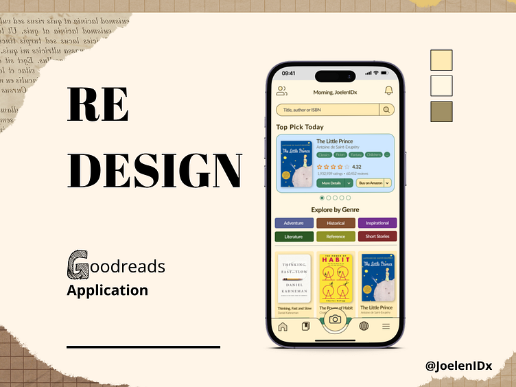
Redesign: Goodreads Application

Hello Friends,
I made a redesign for the Goodreads application. Sometimes I feel confusion when opening that application for the first time, and maybe for other users as well. That's why I made a UI design for the homepage where the focus is on the user opening the applications where available books will be displayed (maybe with searching, exploring by genre, etc.).
UI Goals:
Minimizing the search feature into one way (on the homepage)
Displays book recommendations directly without having to search first on the homepage
Users can directly use the scan book feature on the navbar (where the user has to point his finger up on the search button on the current Goodreads display).
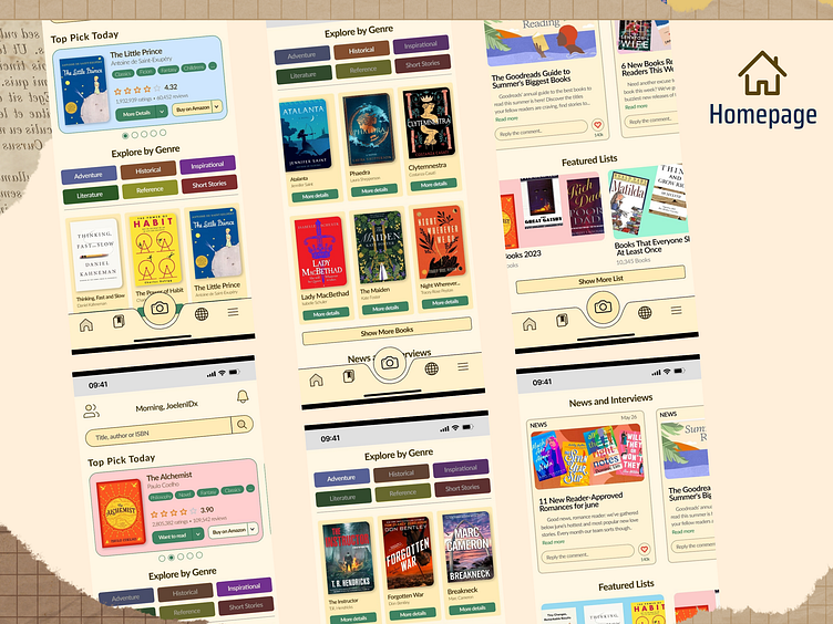
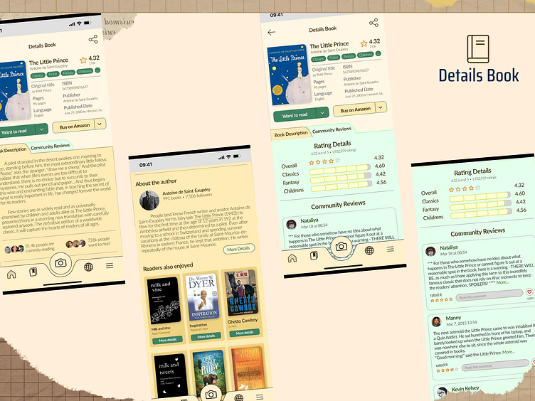
Here the short design review (If the picture is blur, you can try the prototype):
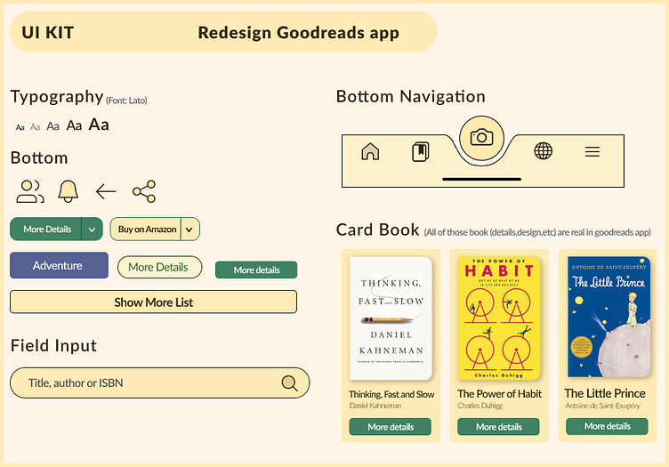
And.. Here the UI Kit what I had used it (with color light brown and simple UI):..
Try the Prototype here (Figma)
I hope you like it that design,
Any feedback is very welcomed for me :)
Connect to me: