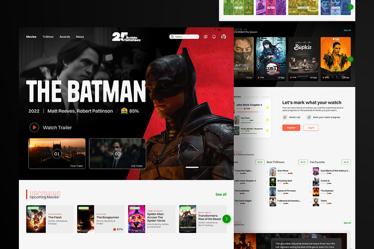
Redesign Rotten Tomatoes website
Hi Everyones!
Introducing my redesigned Rotten Tomatoes website!🍅🎬 With a user-centric approach, I've created a simple and clear homepage, ensuring a seamless experience for users to find what they need without any complications. The hero section prominently showcases one of the freshest releases, captivating users from the moment they land on the page. Take a closer look at my visually enhanced design and share your valuable feedback! Your input is highly appreciated! 🌟
For a full preview, keep scrolling✨
What do you think?
Thanks for checking out my redesigned Rotten Tomatoes website! Hope you like it, Feel free to give feedback. I'd love to hear your thoughts and feedback in the comments below. Your input is valuable in helping me improve the app. And don't forget to press "L" or the love button if you like 😊
📧 Care to collaborate with us? We are available for new projects and collaboration ozirostudio@gmail.com | Instagram


