Raise Logotype
A primary choice for the branding for a charitable giving startup that raises money for your favourite charities every time you shop online.
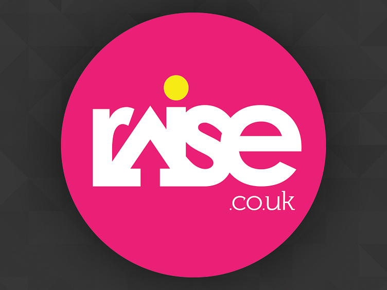
The logotype uses an integral "up arrow" in the "A" of raise and the yellow dot above the "i" is to represent a sunrise, representing the idea of raising.
The type is hand set and negatively kerned to create a flow between the "A" and "S" and interplay between the individual letters of the word.
Overall this logotype was intended to be highly recognisable and standout within a bland marketplace. The 'A' was designed to be used on its own to create a short-form logo device.
This version was not eventually chosen (in favour of a more staid approach) and the brand was eventually changed to goraise.co.uk for legal reasons.
