Redesign Health Insurance
Project Overview: I worked for an insurance company that provides an innovative insurance solution. Having a partnership with 20+ insurance providers. Trying to give the best insurance-buying experience on the web & most importantly on mobile view
My role:- UX Designer | Duration:- 10 Weeks
How older designs look like:
Identify & defining the problem through research:-
The methodology used: Usability Testing | Competitor Analysis | User Interview
Takeaway keynotes:-
Awareness issue:- There is no educating content so that users can understand the importance of health insurance
Decision paralyzed- Having less information, which leads to confusion & decision paralysis.
Time-consuming:- A long form with repeated information makes the form lengthy & time-consuming
No access to purchased policy:- There is no access to the purchased policy, which created a trust issue, they feel annoyed in case of emergency.
Enhance overall website performance
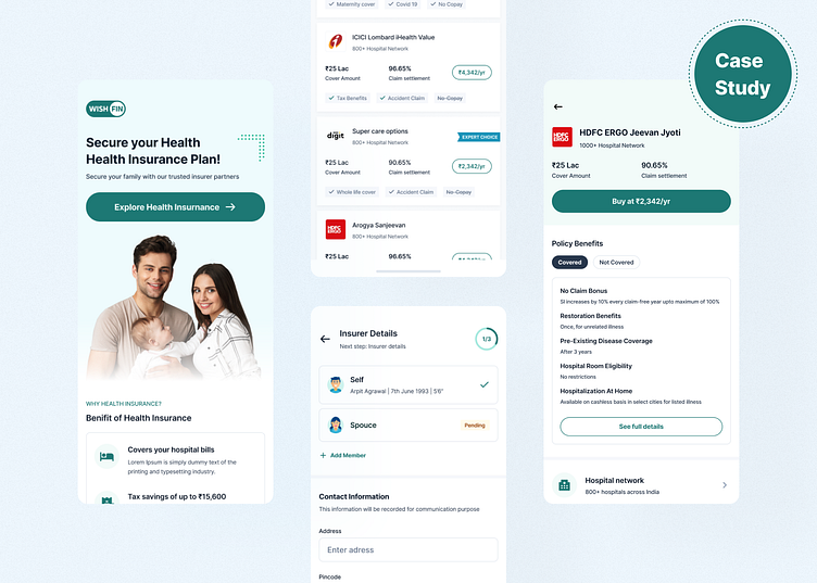
How new design look like
Policy buying experience:- Added more relevant information upfront along with a policy detail page so that users can take decisions. ↓
Time consuming form:- Removed repeated information & restructured form in such way that user can fill it easily. ↓
Post Buying experience: Created post buying experience to have access for purchased policies. Also can take action/help in case of needed.
Thanks for watching, Hope you enjoyed my work.
Don't forget to show us love. Press “L”.
✉️ Available for your long-term or short-term partnership arpit.design07@gmail.com


