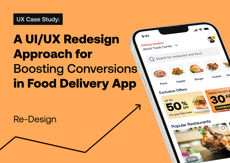
Boosting Conversions in Food Delivery App
Background:
As a UI/UX design team and users of mobile food delivery applications, including major players like Talabat, Deliveroo, Noon, Zomato, and more, we noticed particular pain points while using "Pick.a", a delivery service in the UAE. Based on our experience in visual design and usability, we decided to apply user-centered design principles to refine its interface and create a high-converting home, menu & item selection page.
The Problem:
In the industry of web design and mobile app design, user interface design plays a significant role in shaping the user experience. The initial interaction with "Pick.a" was not as efficient as expected, primarily due to its non-responsive design and color scheme dominated by blue - a color that is known to suppress appetite! The user experience was affected by poor information architecture, reducing the overall persuasive user experience.
The Solution:
With an eye on developing an effective food ordering platform and a reliable delivery service, we proposed the following changes to the app's home, menu, and item selection pages to ensure a seamless food delivery experience.
Brand Color Change: As part of enhancing the user interface design, we replaced blue with colors associated with appetite, invoking positive emotional design reactions and potentially improving conversion optimization.
Category Redesign: Applied behavior-driven design principles to make food categories more appealing and navigable, ensuring a fast and easy ordering experience.
Promotional Offers Banner: Redesigned the promotional banner with persuasive design principles, focusing on making it an effective trigger for conversion.
Informative Restaurant Card Section: The restaurant listing section was enhanced using solid UX psychology principles to provide essential information in a comprehensive manner.
Menu Bar Redesign: In line with user engagement strategies, the bottom menu bar was streamlined, leveraging universally recognized icons with names for improved usability.
Reflections
This project was a lesson in how a seamless food ordering experience can be achieved by integrating user interface design and user experience design. It highlighted the importance of responsive design and persuasive UX in crafting a high-converting food delivery app.
Despite the absence of user data, we believe that the redesign can significantly improve user engagement and satisfaction, paving the way for a reliable and quick food ordering experience. Embracing a user-centered design approach, we look forward to future opportunities to optimize other features of the app and continue to enhance its efficiency.
Better view on Behance


