eBay View Item Redesign
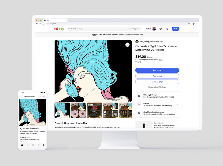
Partnered with the View Item team to redesign eBay's most important and profitable page; View Item (aka Product Page). We approached the design cross platform for a responsive and harmonious experience across mobile web and native devices as well as desktop. Pictured here is an overview of the viewport above-the-fold across several key categories to showcase the frameworks extensibility.
Key highlights:
2 column framework that can scale for any item sold on eBay
Large image components to allow users to focus on what matters most
Dedicated buy area with key actions for quick/easy purchasing
Elevated seller modules to build trust and highlight stores
Modals to surface additional content and avoid taking users off page
Modern and clean UI that allows users to easily scan page contents
The new View Item page has been broken down into incremental rollouts with the first version live to a small percentage of users today.


