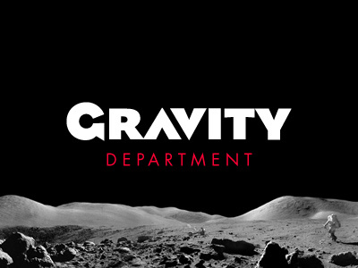
Gravity Department // Logotype
What goes up, we bring down.
If the year was 1953, when slogans were considered useful, that would have been our byline. We would have ended the Cold War.
But seriously, this is the branding logotype for my studio Gravity Department. The layers of meaning in typeface selection alone demands a written recourse. When the TRON placeholder disappears I promise to explain.
Image courtesy of Apollo 17. NASA has the best public domain photographers.
More by Brendan Falkowski View profile
Like
