Roarke Plumbing Co.: Commemorating Their 10th Anniversary.
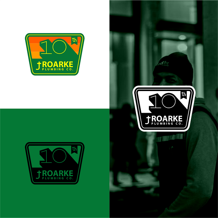
The 10th anniversary logo for Roarke Plumbing Co. is a stunning representation of their dedication to excellence and their reputation as a trusted plumbing service provider. Meticulously crafted using the golden ratio system, this logo showcases a clean, professional design that commands attention and instills confidence.
The logo features a harmonious balance of yellow and orange, evoking a sense of prestige and paying homage to the golden standard of service that Roarke Plumbing Co. has maintained over the past decade. The bold use of these colors represents the company's commitment to delivering exceptional quality and reliability to their valued customers.
Overall, this 10th anniversary logo for Roarke Plumbing Co. captures the essence of their trusted reputation while showcasing their commitment to excellence. Its clean, professional design and the symbolism of the golden hues will undoubtedly resonate with customers, assuring them of the exceptional service they can expect from Roarke Plumbing Co. for years to come.
