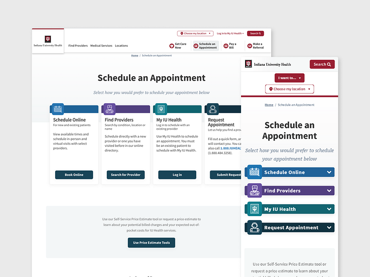
IU Health Schedule an Appointment Redesign
This project was completed in 2023 for Indiana University Health
My Role - Product Designer
Tools Used: Sketch
Overview
To help our patients discover the various methods available for scheduling an appointment, our content team developed a page with all the available options. The goal of this page it to assist with finding the right scheduling option for our patients.
Problem
Our user research team discovered that users were not scrolling down far enough to view all the scheduling options on the page. Instead, they were only able to see the first option, resulting in a limited understanding of the available choices.
Project Goal
Design a layout that ensures all the scheduling options are prominently displayed above the fold, eliminating the need for users to scroll to access all available choices. By achieving this goal, we aim to enhance user visibility and comprehension, enabling them to make informed decisions regarding the best scheduling option for them.
Research
Collaborating closely with our product research team, valuable insights were gathered through heat maps, revealing that a significant 75% of our patients did not scroll beyond the initial view, thus missing out on the availability of additional options.
Our Get Care Now page presents various facility types for patients to choose from, ensuring they receive the most suitable care. Our analysis of this page highlighted that 75% of our patients do scroll to explore and view all the available options. The distinguishing factor lies in the page design, where the options are thoughtfully positioned above the fold, ensuring patients are aware of the additional information below.
Design
By incorporating the information discovered during the research phase, we aim to improve user engagement and awareness, maximizing the visibility of all available options to empower patients in making informed decisions regarding their care.
Due to limited development time I needed to work within the design constraints of current modules in the our CMS system. For this I needed to use a three column layout, working with our content team we prioritized the top three options and displayed them first to allow the patient to be able to see there is more information and to scroll down.
Final Design and Implementation
As I worked with our development team to implement the updated designs they informed us of a module that had not been published yet that supported a four column layout.
During the time between design and development our product team ran A/B testing on our call to action (CTA) buttons and found that teal option improved patient interaction by 168%. I changed the CTA buttons to utilize this insight and to improve patient interaction for scheduling appointments.
Our content team collaborated with the marketing team to ensure the comprehensive availability of all options. Throughout this phase, it came to light that one of the options was restricted to specific locations. In light of this discovery, we made the decision to remove that particular option entirely in order to avoid any confusion for our patients.
Outcome
Since its launch in January 2023, we have monitored the performance of this design, and the initial results have been highly encouraging. Heat maps and click activity indicate that 75% of patients are actively scrolling to explore all available options. Furthermore, those patients are actively engaging with the call-to-action buttons within the cards.
The impact of this update on our patients has been truly gratifying. The enhanced design empowers them to make informed choices by selecting the option that best suits their needs. I am thrilled that this improvement has resulted in an overall smoother and more user-friendly experience for our valued patients.


