IU Health Find Provider Filter A/B Test
This project was completed in 2021 for Indiana University Health
My Role - Product Designer
Tools Used: Sketch
Overview
With a vast network of over 5,000 providers in our system, our provider search results page offers a comprehensive range of filters to assist patients in narrowing down their search and finding the ideal provider that meets their unique needs.
Problem
Through our site survey, we received valuable feedback indicating that locating the filters on our mobile provider search results page posed a challenge for users. Some users reported being unable to find the filters altogether, leading to frustration and abandonment of their search.
Project Goal
The primary objective of this project is to explore different variations of the mobile filter design, focusing on factors such as placement, color, and iconography. By conducting testing and analysis, we aim to identify the most effective option that significantly improves user engagement, measured through click interactions.
By optimizing the filter design, we aspire to enhance the usability and discoverability of the filters, ultimately improving the overall search experience for our users.
Test Results for Test #1
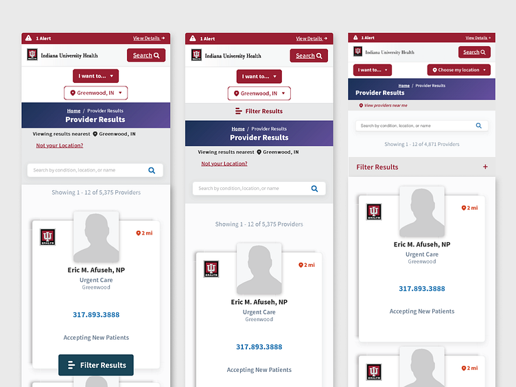
For our initial test, we compared the original design with two variations, primarily focusing on the placement of the filter button on the page. Additionally, we modified the color to a gray shade to assess if placement alone can impact the usability of the button.
Original
The original design features a floating dark teal filter button positioned at the bottom of the page, which remains visible as the user scrolls.
Variation #1
In this variation, the filter button spans the full width of the page and adopts a mid gray color scheme. It features deep red text and a hamburger icon. The button is placed above the providers page header, ensuring it is one of the first elements patients see when they arrive at the search results page.
Variation #2
Similar to Variation #1, the filter button occupies the full width of the page, with a mid gray color scheme and deep red text. However, it incorporates a plus symbol icon instead of a hamburger icon. The button is positioned below the search box, directly above the results, providing a clear correlation between the displayed results and the filter option.
Winner
Following the testing phase, Variation #1 emerged as the clear winner, demonstrating a remarkable improvement in click activity by 39%. This result highlights the effectiveness of the design's placement and color adjustments in enhancing user engagement and interaction with the filter button.
Test Results for Test #2
In our second test, we sought to explore the impact of color on the winning design from our first test. We compared it with two variations, specifically focusing on the color scheme of the filter button.
Original Winning Design
This design features a full-width button in a mid gray shade with deep red text and a hamburger icon.
Variation #1
In this variation, the button adopts a deep red color with white text.
Variation #2
For this variation, the button is dark teal with white text.
Final Outcome
Upon analyzing the results, it was determined that there was no significant improvement in click activity observed between the variations. Consequently, the outcomes were inconclusive in terms of the impact of color on user engagement with the filter button.
These findings highlight the importance of the previously established winning design from the first test, which demonstrated a substantial improvement in click activity. While color variations did not yield a noticeable impact in this second test, the initial winning design can still be regarded as the preferred choice based on its proven effectiveness in enhancing user interaction.


