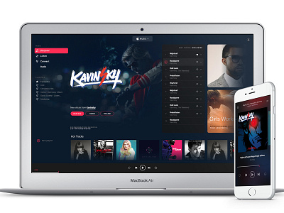
Apple Music redesign: Welcome Screen v.3
Another take on the welcome screen. This version is more open and fluid, it also scrolls horizontally. I'm curious what's your take on horizontal scroll.
Why more cart-like approach? It's better for touch screens, and this is the future imho.
For more info look here: http://bit.ly/applemusicdesign
For exclusive updates on this and my other projects, inspirations and stories on Medium sign up to my personal mailing list: http://eepurl.com/btwLPH
More by Tom Koszyk View profile
Like

