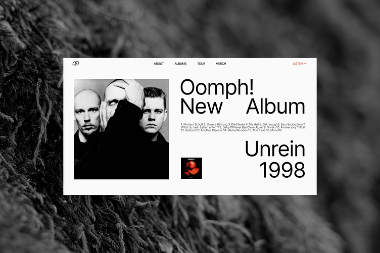
Main Screens for a Website about Oomph!
If I made a website about my favorite band...
I created 4 variants of the main screen about my favorite band. Monochromic colors, big typography, weird photos. That's how I tried to show the atmosphere that I feel while listening to their music: straightforward, sometimes rude, ready to go beyond.
Thank you for watching!
I'm Sophia, a web-designer. I create neat and easy-to use websites for business and experts. See my website to learn more about how I work:
I share more of my design on instagram: instagram.com/sophia.webdesign
Text me on telegram if you have any questions or want to discuss a project: t.me/sophia7723
More by Sophia View profile
Like


